Paperis Articles
Hokusai's Great Wave — Same Design, Different Blues
Where the blues of the series behind a print reportedly made in thousands of impressions came from, how science tells them apart, and how such blues fade
Your field's papers, as audio
Pick your fields and journals — Paperis summarizes the key papers and turns them into audio. Listen on your commute.
Start Paperis free →Hokusai's Great Wave — Same Design, Different Blues
Edo Around 1831
Around 1831, a single print began to sell in Edo (present-day Tokyo), Japan. It is "The Great Wave off Kanagawa," sketched by the Japanese painter Katsushika Hokusai. Translating the original title literally gives "Under the Wave off Kanagawa," and it came out as one piece in the series "Thirty-six Views of Mount Fuji," which views Mount Fuji from various spots (DOI: 10.1162/desi_a_00140). The publication year varies by source, with some writings listing 1829 (DOI: 10.1215/22011919-3616407) and studies recording the series around 1830–33 (DOI: 10.2116/bunsekikagaku.55.121).
In the picture, the crest of a huge wave crested with white spray swoops down from above, and underneath it, three small boats struggle to push through the waves. In the distance, Mount Fuji is visible small with a neat cone shape (DOI: 10.1162/desi_a_00140). The size of a single sheet of paper is a little over 37 centimeters wide, and today, museums around the world including the Metropolitan Museum of Art in New York and the British Museum in London hold this print.
This print is an ukiyo-e. Ukiyo-e are pictures that were drawn and sold—mostly printed as woodblock prints—capturing the lives and scenery of commoners and popular actors in the cities of Japan's Edo period from the 17th century to the 19th century. A woodblock print is an image carved into a wood panel, painted over with pigments, and transferred by pressing onto paper.
This article asks one question of this print. Where did that deep blue that drew the wave come from, and how is it changing now? Studies measuring "The Great Wave" by itself are absent from the evidence gathered in this article, so the answers are found in prints from the same era and the series this print belongs to. To get closer to that answer, we must recount the word "single sheet."
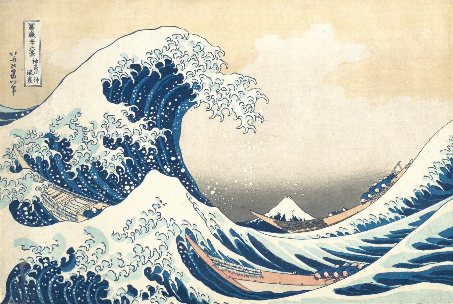
Katsushika Hokusai, Under the Wave off Kanagawa (c. 1831) · impression in the Metropolitan Museum of Art, New York (H. O. Havemeyer Collection) · public domain · Wikimedia Commons
A Single Scene Printed Thousands of Times
Art history researcher Christine Guth writes that "The Great Wave" came out as a cheap woodblock print, and roughly 5,000 to 8,000 copies were printed during Hokusai's lifetime alone (DOI: 10.1162/desi_a_00140). Because it was a product aimed at the mass market and was not made as a one-of-a-kind artwork, Guth explains that in Japan it was long placed in a relatively low position compared to painting, calligraphy, or crafts (DOI: 10.1162/desi_a_00140).
This print does not have a separate "original copy." A print is each individual piece of paper that comes out every time the block is stamped. "The Great Wave" in New York and "The Great Wave" in London are both prints, and each is one of the sheets printed multiple times. Even with the same design, when and with which block it was printed can differ from sheet to sheet.
Making even a single sheet involves multiple wooden blocks. A key block is the wooden block carved with the outlines of the drawing, and color blocks are wooden blocks carved separately to stamp colors one by one inside those outlines. A conference abstract dealing with the metal pigments of 19th-century Japanese prints describes the printing process like this. Color was applied to the block with a brush, mixed with rice flour paste to make it thick and absorb evenly. Dampened paper was placed on the block matching carved registration marks, and the back of the paper was rubbed with a bamboo pad to make the color soak into the front (DOI: 10.1017/s1431927600016299).
Translating this to the scene of "The Great Wave," what the key block handles are thin lines like the curves of the wave crests and the ends of the spray, and the outlines of the boats and Mount Fuji. What the color blocks handle are the wide areas filled inside those lines, in other words, spots like the dark blue inside the wave or the pale color of the sky. In this text, "lines" and "areas" are referred to separately because of these two types of blocks.
The series also grew larger than initially planned. Despite its name, "Thirty-six Views of Mount Fuji" ultimately ended up with 46 designs, and Japanese art history researcher Timon Screech suggests in an essay that the extra ten sheets were inevitably created in response to market demands (DOI: 10.5749/9780816682218-006).
The time when they were printed also does not stay in one era. A 2020 study comparing 141 prints of this series held by various institutions in Europe and America easily distinguished between those printed in the early 19th century and those printed in the early 20th century (DOI: 10.1186/s40494-020-00406-y). This means there is a gap of nearly 100 years between the pieces of paper remaining under the name of the same series.
Looking at "The Great Wave" is looking at one sheet among a single scene printed multiple times. When that single sheet was printed and what kind of blue it holds must be asked separately for each sheet.
The Blue That Crossed the Sea
An Edo bookseller noted down in his miscellany a fan painting of "Chinese Landscapes." The bookseller counted it as the very first work in a new print genre that printed a single blue in multiple shades of Prussian blue. A 2005 paper argues that the fan painting in this record is a fan painting from 1829 by the ukiyo-e artist Keisai Eisen, which is now in the Brooklyn Museum (DOI: 10.7916/d8-hxn2-xg81).
Prussian blue is a dark blue pigment—meaning a powder that gives color to paint—made by humans through a chemical reaction using iron. It was discovered in Berlin in 1704, and because its color was very deep and it was cheap, it was widely used in paintings until the 1970s (DOI: 10.1107/s0909049513004585). Another name, "Berlin blue," also comes from this place of discovery.
Prussian blue entered Japan by ship. The same 2005 paper introduces trade records showing that Dutch and Chinese ships brought in this pigment through Nagasaki. These records show that between 1824 and 1828, compared to Dutch goods, the volume of this pigment suddenly and steadily increased while its price fell (DOI: 10.7916/d8-hxn2-xg81). Nagasaki is the port in southwestern Japan where Dutch and Chinese ships docked at the time.
Around the same time, changes were also happening in Guangzhou, a port city in southern China. Prussian blue traded by the East India Company was used in China to make the color of tea look "good," but around 1825 that trade suddenly stopped. It now seems quite clear that this timing overlaps with when a Prussian blue factory was built at the North Gate of Guangzhou, and the manufacturing method may have been secretly obtained from a London manufacturer (DOI: 10.1179/2047058412y.0000000002). This pigment has also been chemically identified in pigment fragments from Chinese botanical watercolor albums sent from Guangzhou to London between 1817 and 1830. Neither abstract states whether the blue carried by Chinese ships to Nagasaki was made in that factory in Guangzhou. The two facts simply sit side by side in the same time period.
The history of using Prussian blue in Japan had already begun in both painting and printmaking, predating Eisen's fan painting (DOI: 10.7916/d8-hxn2-xg81). Even so, the colors of prints changed around this time. Blue was rarely used in early polychrome ukiyo-e, but in the 19th century blue became the dominant color, and the main reason for this is that the synthetic pigment Prussian blue entered printmakers' palettes around 1830 (DOI: 10.1002/col.22467). Synthetic dyes arrived much later. The first synthetic dye used in Japanese polychrome woodblock prints was a purple dye in 1864, and at first it was used together with Prussian blue to produce a bluer hue (DOI: 10.1186/s40494-018-0187-0).
Hokusai was right in the middle of this current. The author of the 2005 paper suggests that the earliest printed copies from "Thirty-six Views of Mount Fuji" being printed entirely in blue was the result of being directly inspired by Eisen's fan painting, and sees this as a clue to better understand the chronological order in which the series was released (DOI: 10.7916/d8-hxn2-xg81). Based on this evidence, Hokusai stands in the position of an artist who made heavy use of the new blue that was just beginning to spread in his series, and the prints that used that blue first came before that.
Even before Prussian blue arrived, there was blue in prints, and that blue came from plants. Indigo is a deep blue pigment obtained from plants such as the indigo plant. Blue obtained from dayflower blossoms was also used in ukiyo-e (DOI: 10.2116/bunsekikagaku.55.121). Researchers have long assumed that these traditional blues were replaced by the cheaper Prussian blue (DOI: 10.1002/col.22467). The measurements in the next section gauge how these blues were actually used in prints.
The series to which "The Great Wave" belongs came out during the few years when the new blue that crossed the sea was just spreading across Japanese prints.
How to Identify Blues Without Detaching Them
The blue on a print is very thin. According to a previous conference abstract, traditional Ukiyo-e colorants were water-soluble, transparent, and had very small particles (DOI: 10.1017/s1431927600016299). A study on Japanese paintings notes that such thinly applied organic colorants are often difficult to sample by detachment (DOI: 10.1179/sic.2001.46.3.153). The prints themselves are also fragile, so researchers combine several non-destructive methods (DOI: 10.1016/j.microc.2019.104374).
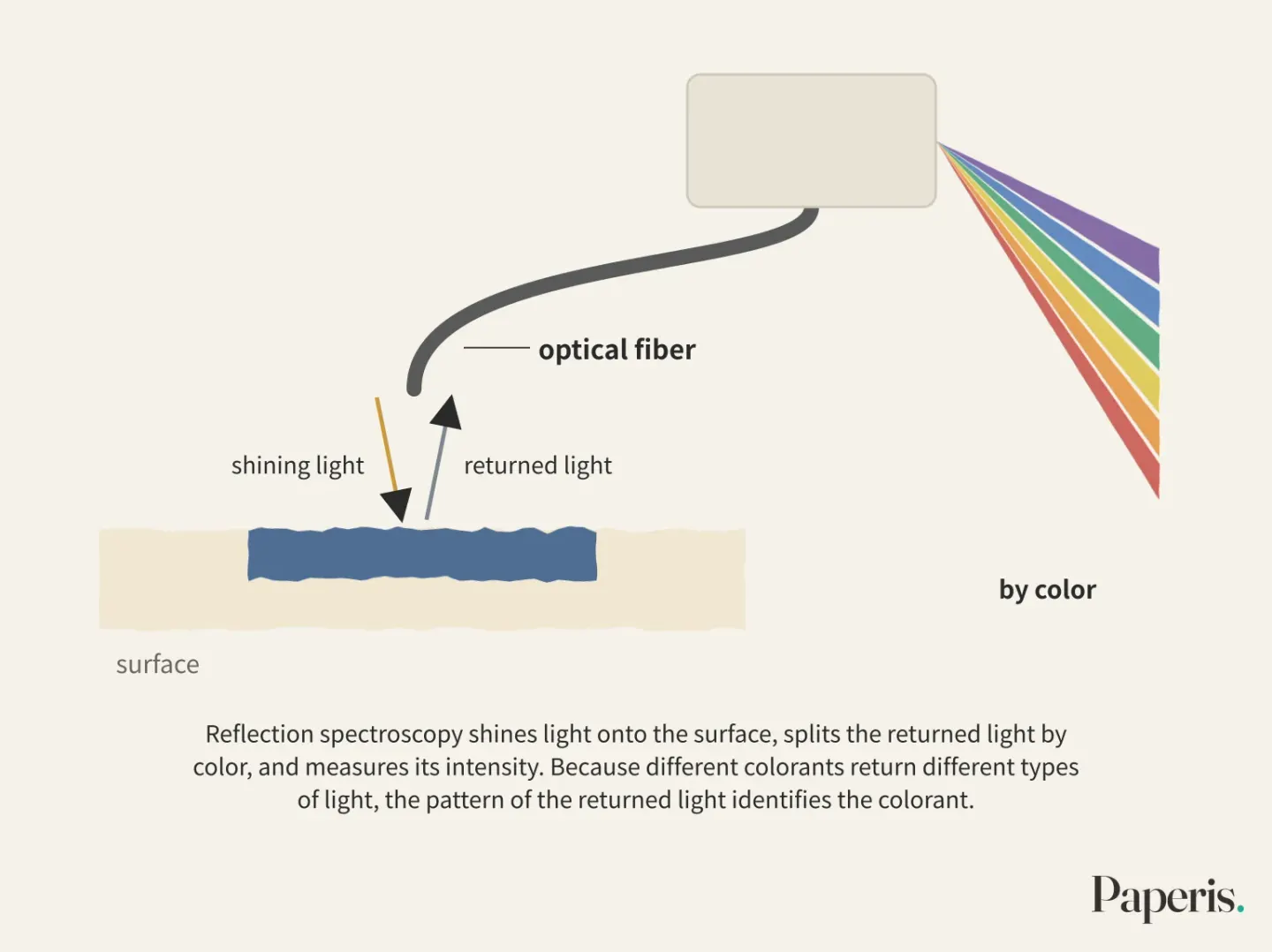
Among these, the fundamental method is shining light. Reflection spectroscopy is a method of shining light onto the surface of a painting, splitting the returned light by color, and measuring its intensity. Because different colorants absorb and return different types of light, we can identify the colorant from the pattern of the returned light. Using an optical fiber with a cut-angled tip and a short-flashing xenon lamp, measurements can be taken without blocking surrounding light and without touching the surface. There is a study that used this method to identify indigo, Prussian blue, and a red insect dye on the spot in two Hokusai paintings rather than prints (DOI: 10.1179/sic.2001.46.3.153).
A 2006 study that directly measured prints from "Thirty-Six Views of Mount Fuji" first measured standard color swatches. The three colorants—dayflower, indigo, and Prussian blue—showed distinct patterns from red light to invisible near-infrared in the 630 to 900 nanometer range, and the three could be easily distinguished by those patterns (DOI: 10.2116/bunsekikagaku.55.121). Next, the research team measured 36 printed copies of this series in which the outlines were printed in blue.
The results differed from previous assumptions. In all 36 copies, the outline block was printed in indigo, and the color blocks were all Prussian blue. It had been commonly believed that the outline blocks were also printed in Prussian blue. The same pairing—namely, indigo for the outline block and Prussian blue for the color block—also appeared in 5 printed copies of Hokusai's waterfall series from around the same period (DOI: 10.2116/bunsekikagaku.55.121). In the printed copies measured by that study, the two blues divided the work within a single sheet. The plant-based blue was responsible for the lines, and the imported blue for the broad areas.
However, the two blues can also be mixed. A 2019 study takes as a clue what happened in a single print by the Japanese Ukiyo-e artist Kitagawa Utamaro. To visible light reflection, it appeared that only indigo was used, but using another method to see the light absorbed by bonds within molecules via infrared radiation, Prussian blue was also present (DOI: 10.1002/col.22467). The research team made color swatches mixing indigo and Prussian blue in various ratios and measured them using multiple methods. The infrared method consistently detected Prussian blue, while it was more difficult to detect indigo mixed with Prussian blue. True to the paper's title, one blue can mask another.
A 2020 study utilized this mixing in reverse. The outline spectra of 141 printed copies of "Thirty-Six Views of Mount Fuji" held by various institutions in Europe and America were measured using reflection spectroscopy, and the signals of the indigo and Prussian blue mixtures contained within them were compared using statistical methods. The printed copies were divided into nine groups, and the mixing ratio differed slightly from group to group (DOI: 10.1186/s40494-020-00406-y). The research team examined printed copies where the same design appeared across multiple groups through the eyes of a print expert, arranged the groups in the order they were printed, and constructed a production timeline for all 141 copies. The authors wrote in 2020 that this is the only study to systematically handle a Hokusai print collection of this size by combining chemical analysis, statistics, and visual appraisal. The blend of blues served as a clue to gauge the print group and its sequence.
The results of the two studies disagree on the outlines. The 2006 study found indigo in the outline blocks, while the 2020 study found a mixture of indigo and Prussian blue in the outlines. Both studies measured light reflected through optical fibers, but the measured printed copies differ, and the 2020 study compared mixing signals using statistical methods. The two abstracts do not address each other's results. In Utamaro's print used as a clue in the 2019 study, only indigo was visible via reflection of visible light while the infrared method found Prussian blue, but no study gathered in this text measures whether that result explains the discrepancy between the two studies.
The results of naming and measuring "The Great Wave" alone do not appear separately in these abstracts. The 36 copies from 2006 and the 141 copies from 2020 are printed copies from the entire series. The blues of the series' printed copies consist of different colorants and mixtures depending on the lines and areas, and depending on the printed group. What can be said right now about the blue of "The Great Wave" is up to the tendencies of those series' printed copies.
When Blue Fades
There are two ukiyo-e prints of the same design made in the late Edo period. One print has its blue well-preserved, while the other has faded severely. When a 2010 study compared the same spot on both prints, the concentration of iron—the main component of Prussian blue—in the faded blue had dropped to one-third of that in the unfaded side, and the traces left by the carbon and nitrogen bonds of this pigment in the infrared spectrum had also vanished (DOI: 10.2320/jinstmet.74.158). What the design was does not appear in the abstract. When the same research team artificially aged the unfaded side by placing it at 353 kelvins, or about 80 degrees Celsius, and 65% relative humidity, the peak intensity of the light it reflected gradually lowered.
Those two prints show that two copies of the same design can possess such different blues today. What made that difference is not told by that abstract.
Studies that peer into the mechanism of fading find answers using model samples. The fading of Prussian blue stems from some of the iron atoms in the pigment gaining an electron and changing their state, and the degree of this varies greatly from artwork to work (DOI: 10.1039/c3ja50025j). In model samples where Prussian blue was applied to paper, simply contacting paper could alter the pigment's structure before it faded, and not only the chemical composition of the paper but also the weave of the substrate holding the pigment greatly changed the fading pattern (DOI: 10.1039/c3ja50025j). In other model samples where Prussian blue was embedded in paper fibers, altering the acidity of the paper and the amount of alkali ions changed the speed and degree to which the iron changed. This experiment examined changes by shining X-rays instead of light, inducing alterations similar to those caused by visible light (DOI: 10.1021/acs.langmuir.5b00770). A 2016 study concludes that what primarily mediates the fading of Prussian blue in light is the backing paper and the relationship that paper forms with oxygen in the surrounding air (DOI: 10.1088/1742-6596/712/1/012139).
How much Prussian blue fades depends not only on light but also on the paper supporting that blue and the surrounding air. However, these results were obtained using model samples rather than prints, with Prussian blue attached to paper in mind, like blueprints or watercolors.
The fickleness of this blue is an old story. The stability of Prussian blue has been a subject of question ever since its discovery in 1704 (DOI: 10.1186/s40494-014-0026-x). When two representative manufacturing methods from the 18th century were faithfully reproduced, the early manufacturing method produced Prussian blue mixed with unwanted iron compounds and aluminum compounds, and the paint layer made from that pigment tended to turn greenish when exposed to strong light for a long time. That is the very tendency frequently noted in 18th- and 19th-century books (DOI: 10.1107/s0909049513004585). Whether the Prussian blue that entered Japan in the 19th century harbored these impurities does not appear in these abstracts.
Indigo has a different weakness. A 1988 experiment placed traditional Japanese colorants in a dark room for 12 weeks in air with 0.40 ppm of ozone, 22 degrees Celsius, and 50% relative humidity. Among the colorants applied to paper, indigo and turmeric, along with several other plant colorants, reacted with ozone, and in a 19th-century Japanese woodblock print, the color faded noticeably only in the blue and green areas containing indigo (DOI: 10.1179/sic.1988.33.1.29). Ozone enters art museums as well. Measured at an art museum in Pasadena, USA, even inside an art museum without air conditioning that chemically filters the air, ozone concentrations reached half those outside (DOI: 10.1021/es00118a011). Because these two experiments were conducted in rooms purposely filled with a set concentration of ozone, they do not directly tell us how fast fading happens in actual exhibition rooms.
The act of measuring itself must also be handled with care. Prussian blue is extremely sensitive to light, including visible light, so even the laser of Raman spectroscopy equipment—which identifies substances by scattering light using a laser—can alter or damage the sample. A 2018 study that tested various Prussian blue pigments suggested a "safe zone" where analysis can be performed without damage when the laser output is between 0.005 and 0.06 milliwatts (DOI: 10.1002/jrs.5366). This blue reacts even to the light used to observe it.
There are also ways to locate faded areas. A 2025 study that examined ten ukiyo-e prints from a museum in Lugano, Switzerland, using non-invasive methods confirmed that Prussian blue—called beroai in Japan—was widely used both alone and mixed with other colorants. In the same study, ultraviolet fluorescence photographs revealed decorative patterns that had become inconspicuous due to fading and traces of past water exposure (DOI: 10.3390/heritage8090349). What a single sheet has gone through remains as traces on that paper.
That two copies of the same design can differ greatly, and that the degree of fading varies significantly from artwork to artwork, is the extent of what these pieces of evidence tell us. What blue any single surviving "The Great Wave" print possesses today can only be known by measuring that specific sheet.
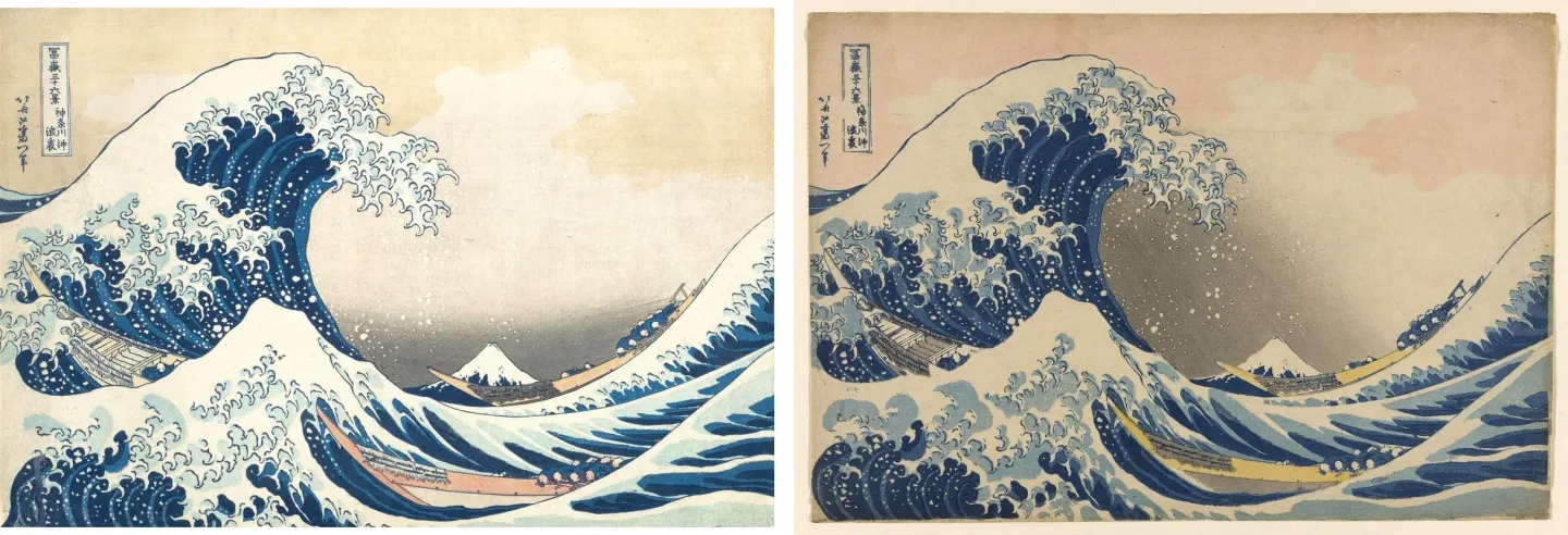
Two impressions of the same design side by side — no study among this article’s sources measured these two sheets · left: Metropolitan Museum of Art, New York (H. O. Havemeyer Collection); right: Art Institute of Chicago (CC0) · public domain · Wikimedia Commons
When You Place Two Sheets Side by Side
With the facts up to this point, let's place two printed copies of the same design from "Thirty-Six Views of Mount Fuji" side by side. The two sheets came from the same preliminary drawing, but each paper may hold a different story. Even if the two sheets in the image above are the "Great Wave", the measurements gathered below are not of those two sheets, but the results of serial printed copies.
First is the outline. In the printed copies measured by the 2006 study, the outline block was printed in indigo (DOI: 10.2116/bunsekikagaku.55.121). In the printed copies measured by the 2020 study, the outline was a mixture of indigo and Prussian blue, and that blend differed slightly with each batch printed (DOI: 10.1186/s40494-020-00406-y). The 2020 study divided 141 sheets into nine batches according to their blend, and then compared printed copies of the same design across multiple batches with the eye of a print expert to determine the order of the batches. If the two sheets are in such batches, clues arise to gauge which one was printed earlier. One of the two might have been printed in the early 20th century.
Next is the broad blue area. In the 36 sheets measured by the 2006 study, the color blocks were all Prussian blue (DOI: 10.2116/bunsekikagaku.55.121). The abstract of the 2020 study covers only the outline and does not separately mention the blue of the color blocks.
Last is the time these two sheets have passed through. The degree to which Prussian blue fades varied in model experiments depending on the underlying paper and surrounding oxygen (DOI: 10.1088/1742-6596/712/1/012139). The indigo in the outline is the colorant that faded in an experiment where it was placed in air containing ozone without light (DOI: 10.1179/sic.1988.33.1.29). Just how much these two sheets have actually faded can only be known by measuring the two sheets.
A researcher measuring the two sheets takes nothing off from either, and instead shines light and measures the light that bounces back. However, when measuring Prussian blue with Raman spectroscopy using a laser, one must be careful with the laser power (DOI: 10.1002/jrs.5366).
Even for printed copies from the same design, the blend of blue differs depending on the printed batch, and the state remaining now can vary greatly from sheet to sheet. "Same Design, Different Blue" is the distance between those two sheets.
From Waves to a Global Picture
Put before the same wave, people see different things. Christine Guth writes that while "The Great Wave" is read in its native Japan as a wave raised by the wind, viewers in Europe and West often read it as a tsunami (DOI: 10.1162/desi_a_00140). This picture does not deliver a single fixed meaning, Guth explains, but is read in multiple meanings that contradict one another depending on where the viewer stands.
There are also studies that examine the true nature of the wave through physics. A 2009 paper asked whether Hokusai really had a tsunami in mind. The authors examined the painting itself and the circumstances of its creation, evaluating the wave using the fluid dynamics of a breaking wave. The authors concluded that this wave belongs to the type where the crest curls forward and plunges down, and it is more likely that what Hokusai intended to draw was an unusually large storm wave rather than a tsunami (DOI: 10.1098/rsnr.2007.0039). The authors add that science's interest in such abnormally high waves was large around the time the paper came out.
Interpretations also diverge on how the picture spread across the world. A chapter from a book published in 2015 argues that the technique used to make this print and its materiality were just as important to the spread of this picture as who the artist was or what style he painted in. The same chapter asks whether this print was even a widely sold picture during Hokusai's lifetime (DOI: 10.21313/hawaii/9780824839598.003.0001). This detail is based on the abstract of that book chapter. Screech suggests in an earlier essay that Hokusai has been recognized in the West from almost the time he lived up to the present, and that fact raised his standing within Japan (DOI: 10.5749/9780816682218-006). A 2016 essay notes that works rewriting this picture today borrow this wave to speak of anxieties about the 2011 tsunami and Fukushima nuclear accident, as well as climate change and ocean pollution (DOI: 10.1215/22011919-3616407).
What this wave depicted and why it spread to the world are matters of researchers' interpretation, and a book chapter placing weight on the technique and materiality of the print creation even asks whether this picture was widely sold during Hokusai's lifetime.
Remaining Questions
There are three questions about the blue in "The Great Wave" that are not closed by the evidence gathered in this article. The first is the measurement of a single sheet of "The Great Wave". The measurements currently available are for 36 and 141 sheets of the series, and the results of measuring "The Great Wave" by name alone do not appear separately in these pieces of evidence. The second is the path the blue traveled. The evidence connecting the two facts placed side by side in this article—namely, the Prussian blue in the Nagasaki trade records from 1824–1828 and the factory that entered the North Gate of Guangzhou around the same time—is not in these abstracts. The third is the blue of the outlines. The 2006 study looked at indigo, the 2020 study looked at a mixture of indigo and Prussian blue, and the two studies measured different printed sheets. An example of a print in which one of the two mixed blues was not visible by visible light reflectance but was revealed by an infrared method was introduced in a 2019 study, but whether this explains the discrepancy is not in the evidence gathered in this article.
"The Great Wave" is a print recorded as having been printed in the thousands during Hokusai's lifetime, and the blue of that series was created together by the new blue that crossed the sea and the old plant blue, so even for the same design, the composition differs depending on the batch printed, and the condition that remains today can also differ from sheet to sheet. The blue of "The Great Wave" seen in an art museum is the result of the path that single sheet has walked.
Source Papers
- "The Local and the Global: Hokusai's Great Wave in Contemporary Product Design" (2012) — DOI: 10.1162/desi_a_00140 — First published in 1831 in "Thirty-six Views of Mount Fuji", printed as cheap woodblock prints with 5,000 to 8,000 copies made during Hokusai's lifetime, held a low status in Japan as mere commodities, read as wind and waves in Japan but commonly as a tsunami in Europe and America, with inconsistent meanings and fluid interpretations.
- "Hokusai's Great Wave Enters the Anthropocene" (2016) — DOI: 10.1215/22011919-3616407 — Cited as an "1829 woodblock print", today's reinterpretations use this wave to speak about anxieties regarding the 2011 tsunami and Fukushima, climate change, and ocean pollution (essay).
- "Analysis of Metallic Pigments Used in 19th Century Japanese Prints" (1999) — DOI: 10.1017/s1431927600016299 — Conference presentation abstract. Traditional colorants are water-soluble, transparent, and fine-particle, while synthetic colorants likely start from Prussian blue in the 1820s, brushed onto the block mixed with rice flour paste, and printed by rubbing wet paper against registration marks using a bamboo pad.
- "Hokusai's Lines Of Sight" (2010) — DOI: 10.5749/9780816682218-006 — Essay. Interprets that "Thirty-six Views of Mount Fuji" ended at 46 plates and the extra ten plates were inevitably a response to market demands, and that Hokusai gained recognition in the West during his lifetime, which raised his status within Japan.
- "Beyond the connoisseurship approach: creating a chronology in Hokusai prints using non-invasive techniques and multivariate data analysis" (2020) — DOI: 10.1186/s40494-020-00406-y — 141 printed copies of "Thirty-six Views of Mount Fuji" from European and American institutions had the reflection spectra of indigo and Prussian blue in their outlines analyzed via multivariate data analysis into 9 groups (with slight recipe variations), creating a production chronology combined with connoisseurship, easily distinguishing early 19th-century from early 20th-century prints, with the authors noting it is the only systematic study of this scale.
- "Hokusai and the Blue Revolution in Edo Prints" (2005) — DOI: 10.7916/d8-hxn2-xg81 — Argues that a fan painting by Eisen from 1829 (Brooklyn Museum) is the first work in the new genre of aizuri using Prussian blue noted in bookseller miscellanies, records of Dutch and Chinese ship trade via Nagasaki (1824–28 showing a rapid, steady increase in volume compared to Dutch products and falling prices), earlier use history within Japan, and proposes that the overall blue in early prints of "Thirty-six Views of Mount Fuji" was inspired by Eisen's fan.
- "Synthesis and fading of eighteenth-century Prussian blue pigments" (2013) — DOI: 10.1107/s0909049513004585 — Discovered in Berlin in 1704, widely used until the 1970s due to its deep color and low cost, 18th-century manufacturing reproduction introduces unwanted iron(III) compounds and alumina hydrates, with a tendency to turn green under light (a tendency sparsely documented in 18th- and 19th-century literature).
- "A note on Prussian blue in nineteenth-century Canton" (2012) — DOI: 10.1179/2047058412y.0000000002 — The East India Company's trade in Prussian blue (for "improving" tea color) cut off around 1825, overlapping with the establishment of the North Gate factory in Guangzhou, possibly obtained secretly from London manufacturers, and chemically identified in botanical watercolors from Guangzhou between 1817 and 1830.
- "A blue can conceal another! Noninvasive multispectroscopic analyses of mixtures of indigo and Prussian blue" (2019) — DOI: 10.1002/col.22467 — The dominance of 19th-century blue is mainly due to the introduction of Prussian blue around 1830, following the long-held assumption that indigo was replaced by the cheaper Prussian blue, where in Utamaro prints visible light reflection shows only indigo while infrared shows Prussian blue as well, and in mixed color samples infrared systematically identifies Prussian blue while identifying the mixed indigo is harder.
- "A timeline for the introduction of synthetic dyestuffs in Japan during the late Edo and Meiji periods" (2018) — DOI: 10.1186/s40494-018-0187-0 — Rosaniline (purple) was the first synthetic dye used in nishiki-e in 1864, initially used alongside Prussian blue for a bluer hue, and the introduction of synthetic dyes was gradual and selective.
- "Non-Destructive Identification of Blue Colorants in Ukiyo-e Prints by Visible-Near Infrared Reflection Spectrum Obtained with a Portable Spectrophotometer Using Fiber Optics" (2006) — DOI: 10.2116/bunsekikagaku.55.121 — Dayflower, indigo, and Prussian blue show distinct patterns between 630 and 900 nm, outline blocks of 36 printed copies of "Thirty-six Views of Mount Fuji" (c. 1830–33) are all indigo (traditionally considered Prussian blue) and color blocks are all Prussian blue, with 5 waterfall series sheets showing the same pairing.
- "Fiber Optics Reflectance Spectroscopy: A Unique Tool for the Investigation of Japanese Paintings" (2001) — DOI: 10.1179/sic.2001.46.3.153 — Non-contact, non-invasive measurement using fiber optics reflectance spectroscopy, where thin organic colorants often prohibit sample collection, identifying indigo, Prussian blue, and a red insect dye in two paintings by Hokusai.
- "Colours of the « images of the floating world »" (2019) — DOI: 10.1016/j.microc.2019.104374 — Combining multiple non-invasive methods to identify 18th- to 19th-century ukiyo-e colorants due to the fragility of prints, proposing a colorant chronology from 1700 to 1900.
- "Deterioration of Ferric Ferrocyanide Pigment in Ukiyo-e Printed in the Late Edo Period" (2010) — DOI: 10.2320/jinstmet.74.158 — Two late-Edo ukiyo-e prints of the same design (one well-preserved, one severely faded) showed the faded blue had one-third the iron concentration and lost cyanide absorption, and artificial aging of the unfaded print at 353K and 65% rh caused its reflectance peak to gradually decrease.
- "Why does Prussian blue fade? Understanding the role(s) of the substrate" (2013) — DOI: 10.1039/c3ja50025j — Fading is the reduction of iron(III) to iron(II), varying greatly across works, where contact alone alters structure in paper model samples, and the chemical composition, dispersion, and texture of the substrate drastically change fading patterns.
- "X-ray Photochemistry of Prussian Blue Cellulosic Materials: Evidence for a Substrate-Mediated Redox Process" (2015) — DOI: 10.1021/acs.langmuir.5b00770 — In cellulosic substrate model samples, X-rays induce reduction just like visible light, and the rate, extent, and nature of reduction are controlled by the substrate's pH and alkali cation content.
- "Time resolved XANES illustrates a substrate-mediated redox process in Prussian blue cultural heritage materials" (2016) — DOI: 10.1088/1742-6596/712/1/012139 — Prussian blue adhered to cellulosic substrates, like cyanotypes and watercolors, undergoes photoreduction and fading mediated primarily by the substrate and its interaction with environmental oxygen.
- "Light and anoxia fading of Prussian blue dyed textiles" (2014) — DOI: 10.1186/s40494-014-0026-x — Questions stability since its discovery in 1704, with the effects of light, anoxia, and substrate types varying significantly by environment.
- "The Ozone Fading of Traditional Japanese Colorants" (1988) — DOI: 10.1179/sic.1988.33.1.29 — Exposed to 0.40 ppm ozone at 22°C and 50% RH for 12 weeks without light, indigo and turmeric reacted on paper, and 19th-century woodblock prints faded noticeably only in blue and green areas containing indigo.
- "Ozone and the deterioration of works of art" (1983) — DOI: 10.1021/es00118a011 — 17 watercolor pigments and 2 Japanese woodblock prints exposed to ozone, finding that indoor ozone in a museum without chemical air treatment (Pasadena) was half that of outside levels.
- "Identification of Materials and Kirazuri Decorative Technique in Japanese Ukiyo-e Prints Using Non-Invasive Spectroscopic Tools" (2025) — DOI: 10.3390/heritage8090349 — 10 ukiyo-e prints from the Lugano Museum analyzed non-invasively to confirm widespread individual and mixed use of veroai (Prussian blue), first analytical evidence of kirazuri using mica, and ultraviolet fluorescence revealing faded decorative patterns and water damage traces.
- "Raman spectroscopy of the photosensitive pigment Prussian blue" (2018) — DOI: 10.1002/jrs.5366 — Prussian blue is extremely sensitive to light including visible light, allowing potential alteration and damage even by Raman lasers, with a safe operating range at laser power between 0.005 and 0.06 mW.
- "What kind of a wave is Hokusai's Great wave off Kanagawa?" (2009) — DOI: 10.1098/rsnr.2007.0039 — Examines the tsunami hypothesis and alternatives using imagery, context, and breaking wave fluid dynamics, concluding it belongs to a plunging breaker and is more likely an exceptionally large storm wave.
- "“Under the Wave off Kanagawa”" (2015) — DOI: 10.21313/hawaii/9780824839598.003.0001 — Book chapter summary. Asks whether it was a bestseller during his lifetime and argues that the technology and materiality used to make the print were as important to its spread as the artist, subject, and style.
Sources (24)
- The Local and the Global: Hokusai's Great Wave in Contemporary Product DesignDOI 10.1162/desi_a_00140
- Hokusai's Great Wave Enters the AnthropoceneDOI 10.1215/22011919-3616407
- Analysis of Metallic Pigments Used in 19th Century Japanese PrintsDOI 10.1017/s1431927600016299
- Hokusai's Lines Of SightDOI 10.5749/9780816682218-006
- Beyond the connoisseurship approach: creating a chronology in Hokusai prints using non-invasive techniques and multivariate data analysisDOI 10.1186/s40494-020-00406-y
- Hokusai and the Blue Revolution in Edo PrintsDOI 10.7916/d8-hxn2-xg81
- Synthesis and fading of eighteenth-century Prussian blue pigmentsDOI 10.1107/s0909049513004585
- A note on Prussian blue in nineteenth-century CantonDOI 10.1179/2047058412y.0000000002
- A blue can conceal another! Noninvasive multispectroscopic analyses of mixtures of indigo and Prussian blueDOI 10.1002/col.22467
- A timeline for the introduction of synthetic dyestuffs in Japan during the late Edo and Meiji periodsDOI 10.1186/s40494-018-0187-0
- Non-Destructive Identification of Blue Colorants in Ukiyo-e Prints by Visible-Near Infrared Reflection Spectrum Obtained with a Portable Spectrophotometer Using Fiber OpticsDOI 10.2116/bunsekikagaku.55.121
- Fiber Optics Reflectance Spectroscopy: A Unique Tool for the Investigation of Japanese PaintingsDOI 10.1179/sic.2001.46.3.153
- Colours of theDOI 10.1016/j.microc.2019.104374
- Deterioration of Ferric Ferrocyanide Pigment in Ukiyo-e Printed in the Late Edo PeriodDOI 10.2320/jinstmet.74.158
- Why does Prussian blue fade? Understanding the role(s) of the substrateDOI 10.1039/c3ja50025j
- X-ray Photochemistry of Prussian Blue Cellulosic Materials: Evidence for a Substrate-Mediated Redox ProcessDOI 10.1021/acs.langmuir.5b00770
- Time resolved XANES illustrates a substrate-mediated redox process in Prussian blue cultural heritage materialsDOI 10.1088/1742-6596/712/1/012139
- Light and anoxia fading of Prussian blue dyed textilesDOI 10.1186/s40494-014-0026-x
- The Ozone Fading of Traditional Japanese ColorantsDOI 10.1179/sic.1988.33.1.29
- Ozone and the deterioration of works of artDOI 10.1021/es00118a011
- Identification of Materials and Kirazuri Decorative Technique in Japanese Ukiyo-e Prints Using Non-Invasive Spectroscopic ToolsDOI 10.3390/heritage8090349
- Raman spectroscopy of the photosensitive pigment Prussian blueDOI 10.1002/jrs.5366
- What kind of a wave is Hokusai's Great wave off Kanagawa?DOI 10.1098/rsnr.2007.0039
- Under the Wave off KanagawaDOI 10.21313/hawaii/9780824839598.003.0001