Paperis Articles
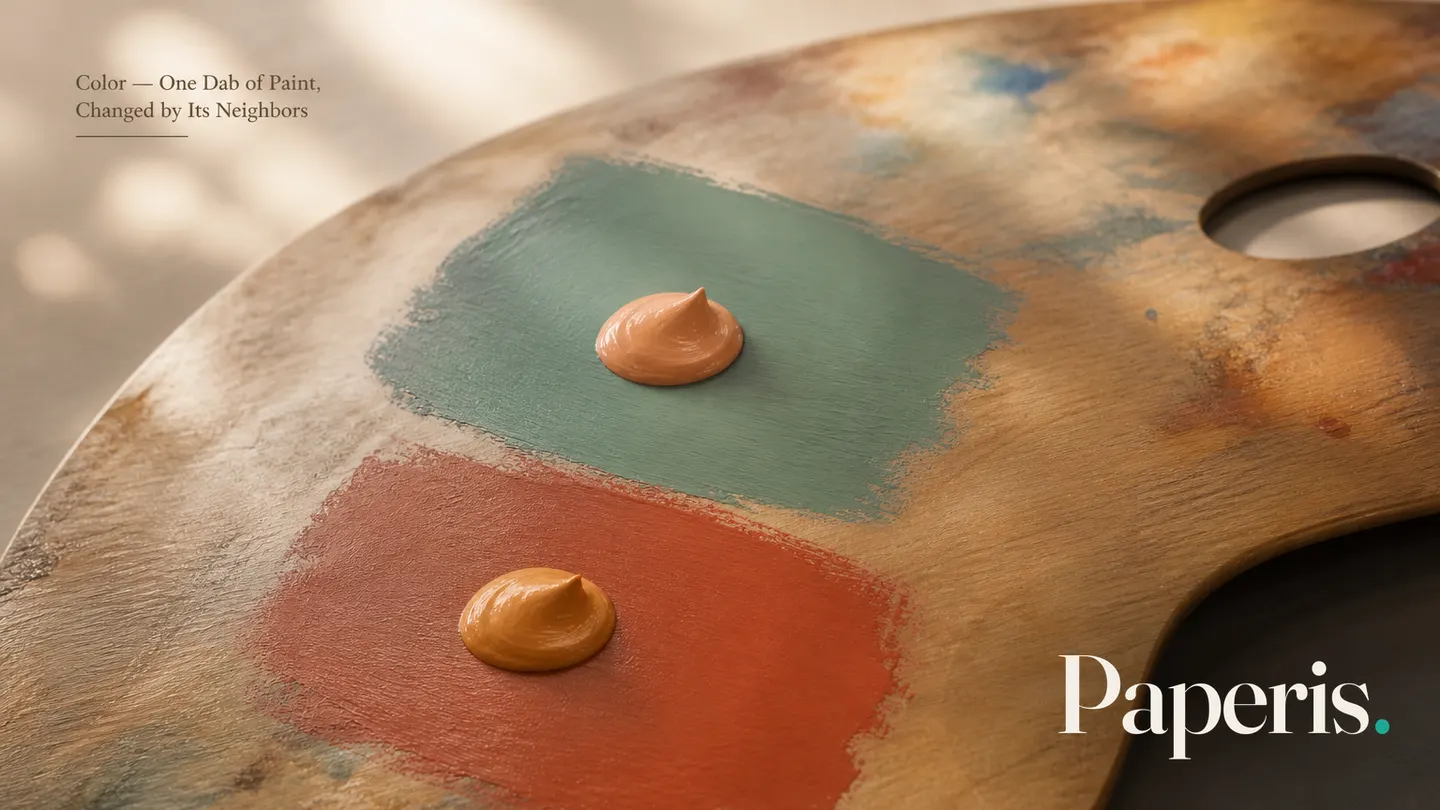
Color — One Dab of Paint, Changed by Its Neighbors
The color in a painting is not set by the paint alone; the eye and brain build it by comparing it with its surroundings and the light. This primer names color by hue, value and saturation, then looks at how neighbors push and pull a color, and how far the evidence on links between color and emotion goes.
Your field's papers, as audio
Pick your fields and journals — Paperis summarizes the key papers and turns them into audio. Listen on your commute.
Start Paperis free →Color — One Dab of Paint, Changed by Its Neighbors
A Few Seconds Before a Still Life
Let us imagine standing before an old still-life painting piled high with fruit. 17th-century Dutch painters were renowned for their skill in rendering the appearance of fruit and flowers as if they were real (DOI: 10.1167/jov.23.13.8). Even standing a few steps away, the orange of the peach and the purple of the grapes catch the eye first. Many people look at those colors for a few seconds and walk on to the next painting.
Is the orange seen during those few seconds exactly the paint the artist applied in that spot? What color an object appears to be is heavily influenced by the light coming from other objects and surfaces seen alongside it (DOI: 10.1146/annurev.psych.59.103006.093619). A single spot of color in a painting is not determined solely by the paint in that place; the eye and brain create it by comparing it to the surroundings.
This article always looks at a single spot of paint together with its neighbors. The neighbor is sometimes a color painted right next to it, and sometimes the light spread across the entire canvas. First, we will equip ourselves with the words to talk about color separately, and then we will look in turn at how neighbors change color, why mixing paint is different from mixing light, and how far color reaches into mood.
Three Words for Dividing Color
Let's say you are describing the color of a peach to someone over the phone. Just saying "orange" falls short. That is because it leaves out whether it is a bright orange or a dark orange, or a vivid orange or a muted orange. When dividing color into words, three properties are commonly used (DOI: 10.4324/9781315794839-6).
Hue is the property that separates colors by the names we give them, such as orange, red, or purple. Deciding whether a peach is orange or red is asking about its hue (DOI: 10.4324/9781315794839-6) (Sachant et al., Introduction to Art ch. 2.04).
Value refers to how light or dark a color is. Sky blue and navy blue both lean toward blue, but sky blue has a high value and navy blue has a low value.
Saturation refers to how vivid a color is. The vivid orange of a freshly picked peach and the faded orange of a fabric left out for a long time have the same hue, but different saturations. As saturation gets lower, the color moves closer to gray (DOI: 10.4324/9781315794839-6) (Sachant et al., Introduction to Art ch. 2.04).
Armed with these three words, you can divide a single color in three directions, like "a slightly dark yet vivid orange." Later on, when neighbors change colors, you will also be able to distinguish which of the three is changing.
The Color Wheel is an Arrangement Made by Humans
You have probably seen illustrations in art class where colors are laid out in a circle. A color wheel is an illustration of colors laid out in order around a circular ring. Standard color wheels depict each color at its most vivid, yet even among these most vivid colors, the brightness varies significantly from one to another (DOI: 10.4324/9781315794839-6).
Complementary colors are two colors placed opposite each other on the color wheel. Art glossary explanations also define complementary colors this way (Sachant et al., Introduction to Art ch. 2.06). However, which colors sit opposite each other depends on which color wheel you use.
The widely used red-yellow-blue color wheel and the color wheel built on light's red-green-blue differ in both the three starting colors and the opposing pairs. An article proposing a new color wheel suited for digital work cites this difference as the basis for its proposal (DOI: 10.53555/eijse.v4i4.163). The color wheel is a tool created to make it easy for humans to pick and pair colors, and its shape changes depending on what is being mixed.
The human eye and brain process color signals by comparing them in opposing pairs—such as red versus green, and blue versus yellow—and the nerve cells that react in this opposing manner extend from the retina of the eye all the way to the cerebral cortex (DOI: 10.1002/col.20611). This opposing pair connects to the direction in which neighbors push colors in the next section.
Neighbors Push Colors
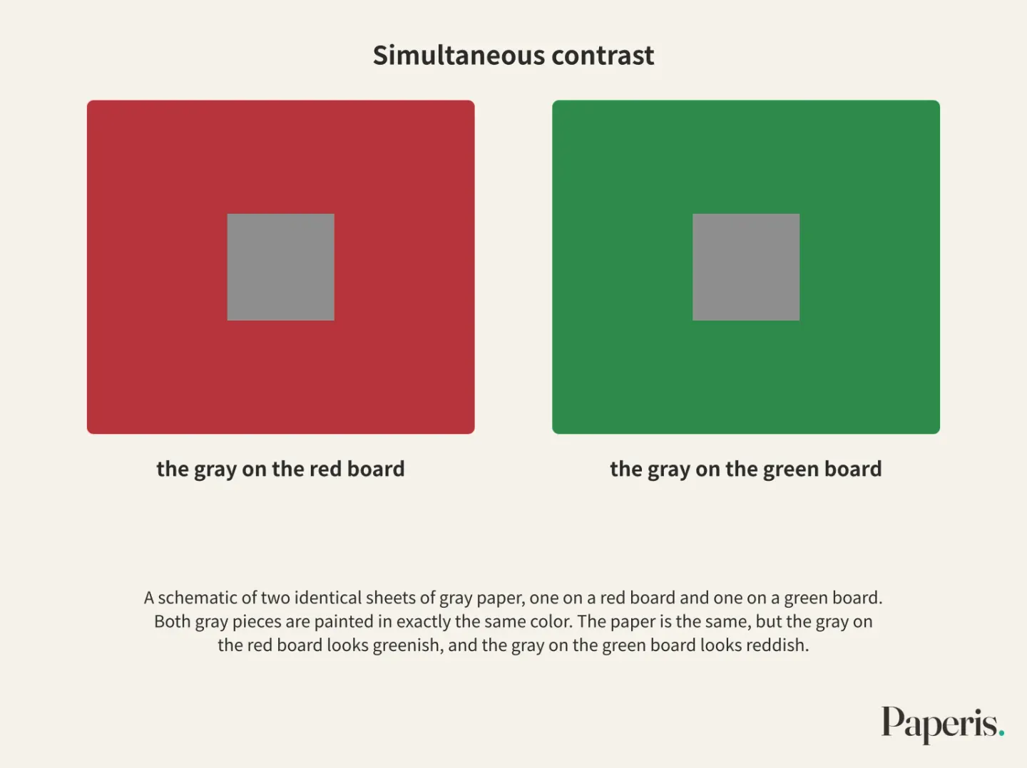
Let us imagine placing two identical sheets of gray paper, one on a red board and one on a green board. The paper is the same, but the gray on the red board looks greenish, and the gray on the green board looks reddish. As we saw in the red-versus-green pair in the previous section, the central color appears pushed toward the opposite of the surrounding color (DOI: 10.1017/s0952523814000224).
Simultaneous contrast is a phenomenon where a color appears pushed toward the opposite of the color immediately surrounding it. The surroundings interfere not only with hue but also with saturation and brightness. In a scene where multiple colors are visible at once, the color of an object is not determined solely by the light reaching the eye from that object (DOI: 10.1146/annurev.psych.59.103006.093619).
This pushing occurs even when we are not conscious of the surroundings. In an experiment where one eye was shown a flashing pattern to mask the surrounding color from consciousness, the degree to which the central color was pushed decreased but did not disappear (DOI: 10.1017/s0952523814000224). In the visual cortex of monkeys, there are cells that respond most sensitively when red and green alternate simultaneously between the center and the surroundings; thus, a researcher who recorded these cells in 1978 suggested that they are involved in simultaneous contrast (DOI: 10.1152/jn.1978.41.3.572).
Neighbors also pull. Color assimilation is a phenomenon where a color appears to resemble the surrounding color. If you draw dark wavy lines on a bright background and add a thin line of a lighter color inside them, the lighter color appears to spread across the entire wide area inside the lines, making that area look evenly tinted (DOI: 10.3389/fnhum.2014.00805). Depending on how they are arranged, neighbors can either push or pull.
Fruit Taken Out of the Basket
The saying that placing complementary colors side by side makes each other shine brighter is commonly heard in art classes. One art textbook notes that Impressionist painters used complementary color schemes to make their canvases shine brighter (Sachant et al., Introduction to Art ch. 2.04). There is an experiment that measured whether surroundings, including complementary colors, make fruit in still-life paintings look more vivid using fruit from still-life paintings (DOI: 10.1167/jov.23.13.8). Because this experiment measured the vividness of fruit in still-life paintings, it did not directly test the textbook's claim about Impressionist canvases.
The researchers selected fruit from high-definition digital reproductions of 48 classical still-life paintings and 64 modern and contemporary still-life paintings. They displayed eight pictures of the same type of fruit at once on a gray background, where half had only the fruit cut out and the other half kept a circular surrounding painting around the same fruit. In this experiment, 15 participants lined up the eight pictures in order of which fruit appeared to have higher saturation (DOI: 10.1167/jov.23.13.8).
The fruit with the surroundings kept looked more vivid. The factors that mainly created this effect were the fruit overlapping with other objects, having another fruit of the same kind in the surroundings, and having varied and uneven surroundings. When the saturation difference between the fruit and its surroundings was large, the fruit actually appeared less vivid, and whether there were complementary colors in the surroundings and whether the brightness difference was large did not produce clear effects (DOI: 10.1167/jov.23.13.8).
The authors conclude that within paintings, the cues tested individually in the laboratory appear together in various combinations to make the saturation appear higher, which makes the fruit more appealing and plausible (DOI: 10.1167/jov.23.13.8). However, this is a single experiment in which 15 participants ranked reproductions on a screen. The neighbors that enhanced the fruit in this experiment were overlap, the same fruit, and varied surroundings, while complementary pairs did not play a clear role. While various studies show that neighbors change color, the direction is more complex than a one-line rule like "put complementary colors next to each other to bring them to life."
An Eye That Sees by Subtracting the Light
A white sheet of paper looks almost like white paper both under morning sunlight and evening lamplight. This is true even though the light entering the eye from the paper is quite different at the two times (DOI: 10.1117/1.jei.26.3.031204). Color constancy is the property of recognizing an object's color as similar even when the illuminating light changes. A review paper suggests that the main purpose of seeing color is less to measure the properties of the light entering the eye than to recognize surrounding objects and materials (DOI: 10.1146/annurev-vision-091517-034231).
One theory explains color constancy as the act of comparing things with neighbors. Edwin Land, who proposed this theory in 1964, experimented using a board pieced together with multiple colored patches, starting from the fact that color constancy cannot be predicted by the amount of light received by the eye's color-sensing cells alone. The model he and his colleagues built compared the brightness of a single spot with various parts of the scene and then integrated those comparisons across the entire scene (DOI: 10.1117/1.jei.26.3.031204).
There is a photograph where what people see diverges depending on how they guess the lighting. Regarding a dress photo that spread on the internet under the name "#TheDress," some people saw it as white and gold, while others saw it as blue and black. In a study investigating this photo, people who saw it as white and gold guessed the lighting in the photo to be bluish light, whereas those who saw it as blue and black guessed it to be yellowish light. People were able to guess the lighting based solely on skin color (DOI: 10.1167/17.12.25). This was a result matching the hypothesis the researchers had established in advance.
The same photo even changed depending on the person. Among participants who had seen this photo before, about half answered that they had come to see it in a different color more than once, and the more professional experience they had dealing with art, the higher the probability of such a change (DOI: 10.1167/17.12.25). The researchers considered that where people direct their attention within the photo is also related to the color they see (DOI: 10.1167/17.12.25). Although the dress photo is not a painting, it serves as a clue that the eye reading color moves together with guesses about the lighting. A 1976 art magazine article cited a researcher's observation that human vision has a sense that separately perceives lighting, forecasting that this sense could become a new path of expression for handling color in the future (DOI: 10.2307/1573116).
Mixing Paint and Mixing Light
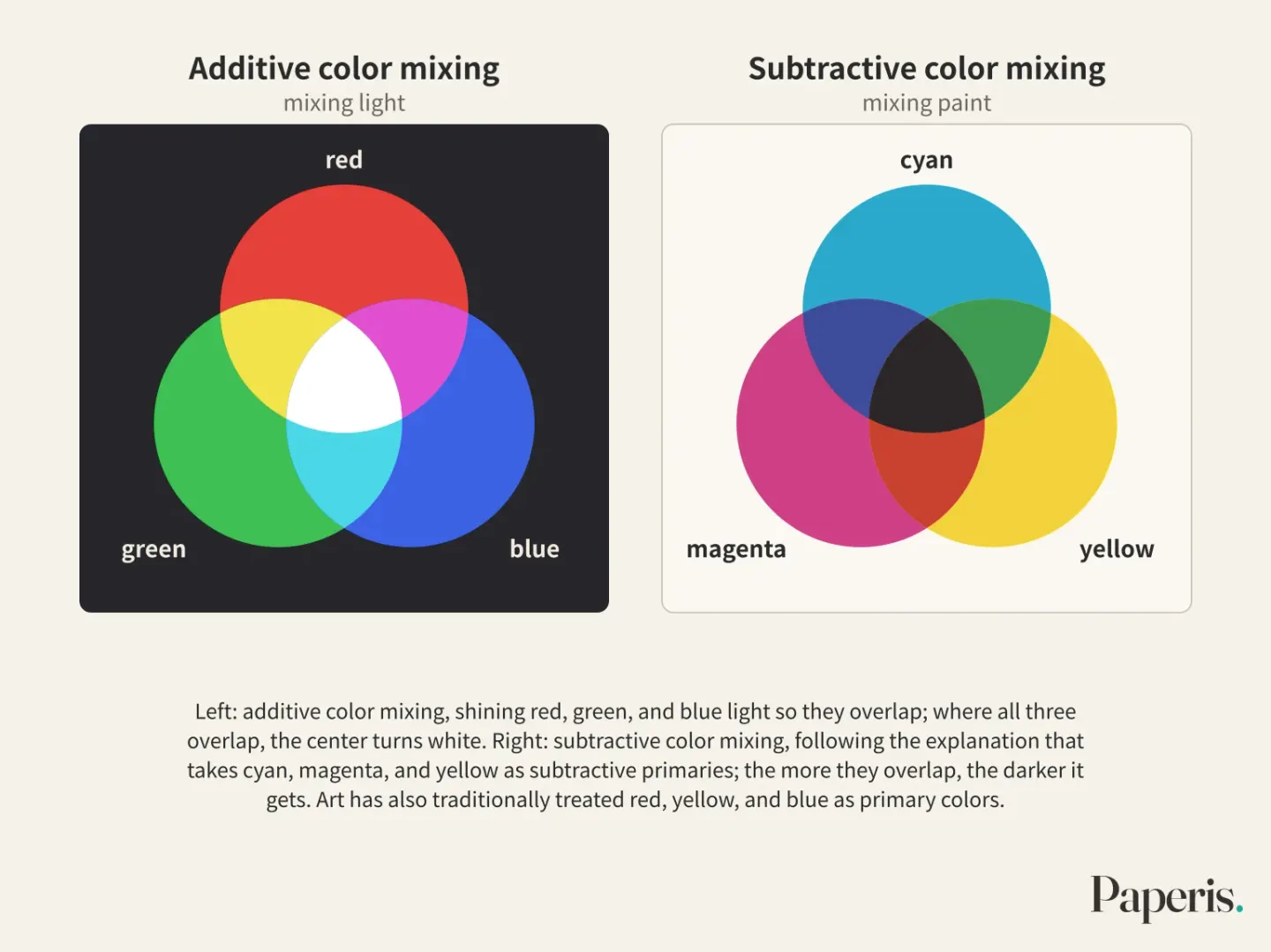
Paint gets darker the more different colors you mix together. But if you shine red, green, and blue light so that they overlap on a white wall, that spot turns white (Sachant et al., Introduction to Art ch. 2.04). This is because the rules differ depending on whether you are mixing paint or light (DOI: 10.4324/9781315794839-6).
Primary colors are a few colors used as a starting point when mixed to create other colors. Additive color mixing is the mixing of colored light by overlapping beams, and the more they overlap, the brighter they get. The primary colors of light are red, green, and blue (DOI: 10.4324/9781315794839-6). Computer screens create various colors by varying the intensity of these three lights (DOI: 10.1119/5.0349953).
Subtractive color mixing is the mixing of paints or inks that absorb part of the light, and the more you mix them, the less light bounces back, moving closer to black. Mixing paints and dyes is subtractive color mixing (DOI: 10.4324/9781315794839-6) (Sachant et al., Introduction to Art ch. 2.04).
What to choose as the primary colors of subtractive mixing has varied depending on the application. Art has traditionally treated red, yellow, and blue as primary colors (Sachant et al., Introduction to Art ch. 2.06), some explanations define the subtractive primaries of paint and dye as cyan, magenta, and yellow (DOI: 10.4324/9781315794839-6), and printer inks also use cyan, magenta, and yellow (DOI: 10.1119/5.0349953). Because these three inks are not perfect, printers use an extra layer of black ink (DOI: 10.1119/5.0349953). Real-world paint cannot be fully accounted for by either additive or subtractive rules alone, so computers use separately established calculation methods when simulating paint mixing (DOI: 10.1145/146443.146452). The three primary colors are starting points chosen to suit the material and purpose.
There is also a way for painters to use light mixing. Pigments are fine powders that give paint its color. By placing small dots of paint side by side on the canvas rather than mixing them on a palette, a painter can mix colors closer to additive mixing. However, normal pigments are not bright enough to produce white, so gathering dots still does not yield white, which is why white paint is still mixed in for the bright areas (DOI: 10.1111/j.1520-6378.1976.tb00032.x). What pigments are made of is covered in "Paint and Materials — The Same Powder, Different Doughs" from this series.
Warm Colors, Cool Colors, and Mood
Painters call a sunset warm and a winter sea cold. Warm colors are those on the red side that dye a sunset, and cool colors are those on the blue side that dye a winter sea. This distinction is commonly used in art (Sachant et al., Introduction to Art ch. 2.04).
The distinction between warmth and coolness is embedded even in the eyes that divide colors. English-speaking participants distinguished two colors straddling the boundary of warmth and coolness better than two colors on the same side. However, this difference appeared only when the colors were seen in the right visual field, and it remained the same in repeat experiments (DOI: 10.1111/cogs.12393).
The feeling a color gives follows saturation and lightness more than hue. In an experiment where 70 people evaluated 218 color samples, lively feelings followed saturation, and strong, heavy feelings followed lightness. Even when judging "warm-cool," the influence of hue was not as large as in previous studies (DOI: 10.1002/col.20246). This means warmth and coolness are not entirely decided by the hue name alone. The three words introduced earlier are used here as well.
A survey comparing university students from five countries showed both overlapping and differing parts in color-emotion pairings. When 661 university students from Germany, Mexico, Poland, Russia, and the United States were asked in this survey published in 1997, anger was paired with black and red, fear with black, and jealousy with red in all five countries. However, the colors paired with envy differed by country, and German students also linked envy and jealousy with yellow. The authors suggest that these associations arise together from shared human experiences beyond culture and from cultures like language, mythology, and literature (DOI: 10.1177/0022022197282002).
Changing the measurement method alters the picture once more. There is an experiment comparing Austrian and German participants with mainland Chinese participants. While previous studies using verbal questioning showed that the good-bad associations of red and green were similar across the two cultures, they diverged in an indirect method that required rapid classification of words or pictures. Conversely, white associations that differed when asked verbally were similar in the indirect method (DOI: 10.1007/s00426-022-01697-5).
Favorite colors also differ from person to person. In an experiment comparing people from children to the elderly in the UK, favorite colors differed markedly by age and sex (DOI: 10.1075/z.167.40lin). In a study (preprint) yet to undergo peer review that gathered judgments from 4,835 people across 10 countries, broad trends in color preference were consistent across countries, but preferences regarding relationships between colors differed by culture (DOI: 10.31234/osf.io/6ekvp_v1).
There are also results that seem to support "red is excitement." In an experiment, 33 men sitting in a mock workspace with red-decorated walls reported higher tension, anger, depression, and anxiety, and lower visual comfort than when the walls were white (DOI: 10.17179/excli2021-3974). However, this is a condition where an entire wall of a room was painted red, and it cannot be directly transferred to a single dot of red in a painting. Among the evidence seen in this section, this is the only experiment that directly measured mood; the rest are surveys asking about associations linking color and emotion, evaluations of feelings given by color, and favorite colors. Although associations linking color and emotion appear in multiple surveys, they vary by culture, person, and measurement method, so they cannot be reduced to a single line like "red is excitement, blue is calm."
Back in Front of the Still Life
Let us return to the first still life. We break the orange of the peach down into three words. The hue is orange, the side that caught the light has a higher brightness, and we compare whether the saturation is higher or lower than the surrounding grapes or cloth.
This time, we curl our hand to cover everything except a single peach. In the experiment that cut out only the fruit, the fruit with its surroundings left intact looked sharper, so it is worth comparing what looks different when you remove your hand. You can also look for whether the neighbors that produced an effect in that experiment are present in this painting as well. These are the spot where the peach overlaps with another fruit, the spot where the same fruit is placed again, and how varied its surroundings are.
We also guess whether the light in the painting is yellowish candlelight or bluish window light. In the dress photo, what you guessed the lighting to be went hand in hand with the color you saw. Lastly, if that painting felt warm, that feeling may involve not only the color, but also the culture the viewer grew up in and the viewer themselves. If you point to the neighbors one by one in front of a painting you used to pass by in a few seconds, it gradually reveals why a dab of paint looks the way it does.
Where to Look Further
- Girl with a Pearl Earring — Light Built in Layers, a Name Not Asked traces how ultramarine blue and thinly applied layers of paint created the colors of a single painting.
- Hokusai's Great Wave — Same Design, Different Blues traces Prussian blue, the blue used in the woodblock print.
- Van Gogh's Sunflowers — The Shadow Settling on the Yellow tells the story of how a painting's yellow and the varnish over it changed over time, showing that the colors we see today may differ from the colors first painted.
- Shading and light direction are continued in Light and Shadow — One Apple, and an Eye That Guesses First from this series; pigments and paint layers in Paint and Materials — The Same Powder, Different Doughs; the representation of depth where distant things look blurry in Perspective and Space — The One Footprint a Picture Is Calculated For; and the paths of the gaze within paintings in Composition and Gaze — Stepping Stones the Painting Lays, a Path the Eye Chooses.
Source Papers
- "Introduction to Art: Design, Context, and Meaning — 2.04 Form and Composition" (Pamela Sachant et al., University of North Georgia Press, LibreTexts) — Sachant et al., Introduction to Art ch. 2.04 — A textbook's description of basic color properties (hue and saturation), mixing that overlaps light versus subtractive mixing of paint, the distinction between warm and cool colors, and Impressionist complementary color schemes.
- "Introduction to Art: Design, Context, and Meaning — 2.06 Key Terms" (Pamela Sachant et al., University of North Georgia Press, LibreTexts) — Sachant et al., Introduction to Art ch. 2.06 — Definitions of complementary and primary color terms (where complementary colors sit opposite each other on the color wheel, and the primary colors of art).
- "Color" (2020) — DOI: 10.4324/9781315794839-6 — Color mixing is treated separately as the additive system of light (red, green, and blue) and the subtractive system of paint (magenta, yellow, and cyan), and colors are described by hue, lightness, and saturation.
- "Color in Complex Scenes" (2007) — DOI: 10.1146/annurev.psych.59.103006.093619 — A review article stating that in a scene where many colors are visible together, an object's color is not determined solely by the light coming from that object.
- "Color Perception: Objects, Constancy, and Categories" (2018) — DOI: 10.1146/annurev-vision-091517-034231 — A review summarizing object color, color constancy, and color categories, based on the view that the primary purpose of color perception is to recognize objects and materials rather than to measure the properties of light.
- "Chromatic induction from surrounding stimuli under perceptual suppression" (2014) — DOI: 10.1017/s0952523814000224 — The push away from surrounding colors (color contrast) remained diminished even under conditions where the surrounding area was blocked from conscious awareness.
- "Color vision mechanisms in monkey striate cortex: dual-opponent cells with concentric receptive fields" (1978) — DOI: 10.1152/jn.1978.41.3.572 — A study recording cells in the monkey visual cortex most sensitive when different colors occur simultaneously in the center and the surround, suggesting they are involved in perceiving simultaneous color contrast.
- "Quantifying the watercolor effect: from stimulus properties to neural models" (2014) — DOI: 10.3389/fnhum.2014.00805 — A review summarizing the watercolor effect, a type of color assimilation where colors resemble the surround (where a pale outline color appears to bleed across a wide area).
- "Complementary colors theory of color vision: Physiology, color mixture, color constancy and color perception" (2011) — DOI: 10.1002/col.20611 — A theoretical paper by a researcher arguing that complementary relationships shape overall color perception, based on opponent color cells in the retina, relay nuclei, and cortex.
- "RGB COLOR WHEEL INTENDED TO CREATE COLOR HARMONY COMPOSITIONS IN MODERN ART AND DESIGN" (2018) — DOI: 10.53555/eijse.v4i4.163 — A paper proposing a new digital color wheel because the primary and complementary color pairs differ between the traditional red-yellow-blue color wheel and the red-green-blue color wheel of light.
- "Context effects on the perception of saturation of fruit colors in still-life paintings" (2023) — DOI: 10.1167/jov.23.13.8 — Fruit in still-life painting reproductions looked more vivid when the surrounding area was left intact (involving overlap, the same fruit, and various surrounds), saturation contrast was lowered, and complementary and lightness contrasts had no clear effect (15 people).
- "Retinex at 50: color theory and spatial algorithms, a review" (2017) — DOI: 10.1117/1.jei.26.3.031204 — A review revisiting Land's color Mondrian experiments and brightness models that compare and combine various parts of a scene.
- "#TheDress: Categorical perception of an ambiguous color image" (2017) — DOI: 10.1167/17.12.25 — People who saw the dress as white and gold inferred bluish lighting, while those who saw it as blue and black inferred yellowish lighting, and the more professional art experience someone had, the higher the probability that the perceived colors would change.
- "Color Perception in Art: Beyond the Eye into the Brain" (1976) — DOI: 10.2307/1573116 — A paper suggesting that color science has been used in art since the Impressionist era, and noting that the sense of perceiving illumination separately from vision could become a path to new ways of expressing color.
- "Getting the picture—Subtractive color mixing with an inkjet printer" (2026) — DOI: 10.1119/5.0349953 — A demonstration of additive mixing, which creates colors using the three primary colors of light, and subtractive mixing with cyan, magenta, and yellow inks, explaining that because the inks are imperfect, a black layer is added.
- "Modeling pigmented materials for realistic image synthesis" (1992) — DOI: 10.1145/146443.146452 — Additive and subtractive mixing theories are insufficient for mixing pigments, so a different calculation method (Kubelka-Munk) is applied to computer graphics.
- "ADDITIVE COLOR MIXTURE WITH FLUORESCENT PIGMENTS AND SPECIAL ILLUMINATION" (1976) — DOI: 10.1111/j.1520-6378.1976.tb00032.x — Painting in small dots can utilize additive mixing, but normal pigments lack sufficient brightness to produce white.
- "Categorical Perception Beyond the Basic Level: The Case of Warm and Cool Colors" (2016) — DOI: 10.1111/cogs.12393 — English speakers distinguished two colors crossing the warm-cool boundary better than two colors on the same side, and the result held in repeated experiments.
- "Investigation of human's emotional responses on colors" (2006) — DOI: 10.1002/col.20246 — In an experiment where 70 people evaluated 218 colors, vibrancy followed saturation and strength followed lightness, and even warmth and coolness were less influenced by hue than previous studies suggested.
- "The Colors of Anger, Envy, Fear, and Jealousy: A Cross-Cultural Study" (1997) — DOI: 10.1177/0022022197282002 — Across 661 university students in five countries, everyone agreed that anger = black and red, fear = black, and jealousy = red, with cross-national differences in items like envy leading to the conclusion that shared experience and culture work together.
- "The good, the bad, and the red: implicit color-valence associations across cultures" (2022) — DOI: 10.1007/s00426-022-01697-5 — In indirect measurements, red-green associations differed between Westerners and mainland Chinese while white associations were similar, conflicting with verbally reported results.
- "Age-dependence of colour preference in the U.K. population" (2011) — DOI: 10.1075/z.167.40lin — A comparison of British children, young adults, and older adults showing clear gender and age differences in color preferences.
- "Visual and Auditory Aesthetic Preferences Across Cultures" (2025) — DOI: 10.31234/osf.io/6ekvp_v1 — A preprint of 4,835 people across 10 countries showing that color preferences are consistent at the categorical level, whereas relational preferences differ across cultures.
- "Effect of warm/cool white lights on visual perception and mood in warm/cool color environments" (2021) — DOI: 10.17179/excli2021-3974 — Thirty-three men in a simulated red-wall workspace reported higher tension, anger, depression, and anxiety, and lower visual comfort, than those in a white-wall space.
Sources (24)
- Introduction to Art: Design, Context, and Meaning — 2.04 Form and Composition
- Introduction to Art: Design, Context, and Meaning — 2.06 Key Terms
- ColorDOI 10.4324/9781315794839-6
- Color in Complex ScenesDOI 10.1146/annurev.psych.59.103006.093619
- Color Perception: Objects, Constancy, and CategoriesDOI 10.1146/annurev-vision-091517-034231
- Chromatic induction from surrounding stimuli under perceptual suppressionDOI 10.1017/s0952523814000224
- Color vision mechanisms in monkey striate cortex: dual-opponent cells with concentric receptive fieldsDOI 10.1152/jn.1978.41.3.572
- Quantifying the watercolor effect: from stimulus properties to neural modelsDOI 10.3389/fnhum.2014.00805
- Complementary colors theory of color vision: Physiology, color mixture, color constancy and color perceptionDOI 10.1002/col.20611
- RGB COLOR WHEEL INTENDED TO CREATE COLOR HARMONY COMPOSITIONS IN MODERN ART AND DESIGNDOI 10.53555/eijse.v4i4.163
- Context effects on the perception of saturation of fruit colors in still-life paintingsDOI 10.1167/jov.23.13.8
- Retinex at 50: color theory and spatial algorithms, a reviewDOI 10.1117/1.jei.26.3.031204
- #TheDress: Categorical perception of an ambiguous color imageDOI 10.1167/17.12.25
- Color Perception in Art: Beyond the Eye into the BrainDOI 10.2307/1573116
- Getting the picture—Subtractive color mixing with an inkjet printerDOI 10.1119/5.0349953
- Modeling pigmented materials for realistic image synthesisDOI 10.1145/146443.146452
- ADDITIVE COLOR MIXTURE WITH FLUORESCENT PIGMENTS AND SPECIAL ILLUMINATIONDOI 10.1111/j.1520-6378.1976.tb00032.x
- Categorical Perception Beyond the Basic Level: The Case of Warm and Cool ColorsDOI 10.1111/cogs.12393
- Investigation of human's emotional responses on colorsDOI 10.1002/col.20246
- The Colors of Anger, Envy, Fear, and Jealousy: A Cross-Cultural StudyDOI 10.1177/0022022197282002
- The good, the bad, and the red: implicit color-valence associations across culturesDOI 10.1007/s00426-022-01697-5
- Age-dependence of colour preference in the U.K. populationDOI 10.1075/z.167.40lin
- Visual and Auditory Aesthetic Preferences Across CulturesDOI 10.31234/osf.io/6ekvp_v1
- Effect of warm/cool white lights on visual perception and mood in warm/cool color environmentsDOI 10.17179/excli2021-3974