Paperis Articles
Light and Shadow — One Apple, and an Eye That Guesses First
Paint a few steps of light and dark on a flat surface and a round object pops out. Bright areas and shadows in a painting tell where the light comes from, and the eye resolves ambiguous shading by mixing a guess that light usually comes from above with the cues on the canvas — one study found that guess carried less weight than expected and could be overturned by faint cues.
Your field's papers, as audio
Pick your fields and journals — Paperis summarizes the key papers and turns them into audio. Listen on your commute.
Start Paperis free →Light and Shadow — One Apple, and an Eye That Guesses First
An Apple on Paper
If you draw a circle with a pencil, it is just a circle. If you shade one side of the inside a little darker, leave a tiny spot blank and white on the opposite side, and lay a dark smudge on the floor beneath the circle, the circle lifts off the paper and starts to look like a ball or an apple. The paper stays flat as it was, and the only things that changed are the bright spots and dark spots painted with the pencil.
If you shine a flashlight on a single apple on a dining table in a dark room, the exact same thing happens in reality. The side facing the flashlight is bright, the opposite side is dark, and a dark spot shaped like the apple falls onto the table. If you move the flashlight to the side, the bright side, the dark side, and the dark spot on the table move together.
If you have ever stood before a painting in an art gallery and walked past it in a few seconds because you did not know what to look at, you can start with this apple and flashlight. This article follows what the light painted on a flat canvas is made of, and how the viewer's eye reads that light.
How a Few Steps of Brightness Build Volume
If you look closely at an apple lit by a flashlight, you will see no line drawn between the bright side and the dark side. The brightness simply steps down one level at a time. There is a word for this brightness. Value is how light or dark a color is.
Then why does the brightness change? If you shine a flashlight straight at the front of an apple, the center is brightest, it grows darker toward the edges, and the back is pitch black. Shading is how value changes step by step depending on how much a surface faces the light. Even if you only paint this sequence of brightnesses on paper, the viewer reads a round mass (Sachant et al., Introduction to Art ch. 2.04). If you only have a pencil, the spots where you layer your strokes become the darker steps (Sachant et al., Introduction to Art ch. 2.04).
Shading and shadows are one of several cues that let us read depth in a flat picture (DOI: 10.1163/156856808784532518). If something round in a painting looks round, the path of brightness stepping down from the bright side to the dark side is what creates that volume.
Shiny Dots and Two Kinds of Shadows
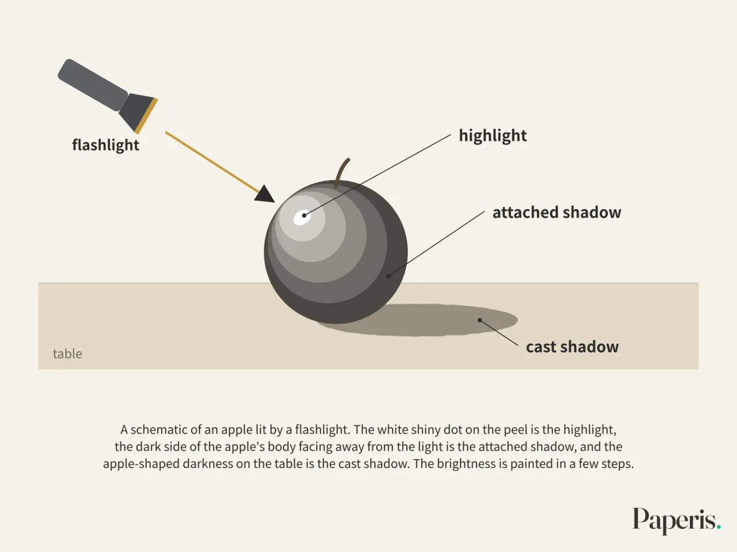
We look at the apple lit by a flashlight again. There is a white shiny dot on the peel, an unlit dark side on the apple's body, and a fallen shadow on the table. The three spots each have different names.
A highlight is the spot where light bounces off a smooth surface like a mirror, forming the brightest point on the object. The shine on a painted grape seed is linked to how much this spot stands out from its surroundings and how blurry it is (DOI: 10.1167/19.3.7).
An attached shadow is the dark area formed on the object's own body, facing away from the light. The dark side of the apple is this. A cast shadow is the dark spot that an object drops onto another surface by blocking the light. The apple-shaped darkness on the table is this.
Both shadows are clues that tell us where the light comes from, and the eye reads the bumps and hollows on the screen using those clues. In an experiment testing shapes in paintings, the pattern of attached shadows placed on a shape with clear bulges and recesses influenced how people read shapes with ambiguous bumps and hollows. In a subsequent experiment, the interpretation of ambiguous bumps and hollows was decided by the cast shadow alone (DOI: 10.1068/p130479). The researchers conclude that the position of the light source interferes with reading the bumps and hollows in a picture. By looking at which way the shadows fall, you can guess where the painter placed the light.
Paintings with a Strong Opposition of Light and Dark
When calculating the change in brightness on the back wall of Caravaggio’s 1599–1600 painting The Calling of St Matthew, the source of that light traces back not to a distant sun, but to a nearby light source a few meters outside the picture frame. Applying the same method to the floor of Georges de La Tour’s 1645 painting Christ in the Carpenter's Workshop, an explanation placing one light source near the painted candle fits slightly better than an explanation placing two light sources—one for each of the two figures (DOI: 10.1117/12.806267). This reverse-engineered the position of the light from the brightness within the painting, assuming that the floor is flat, the wall stands straight, and the light comes from a single point.
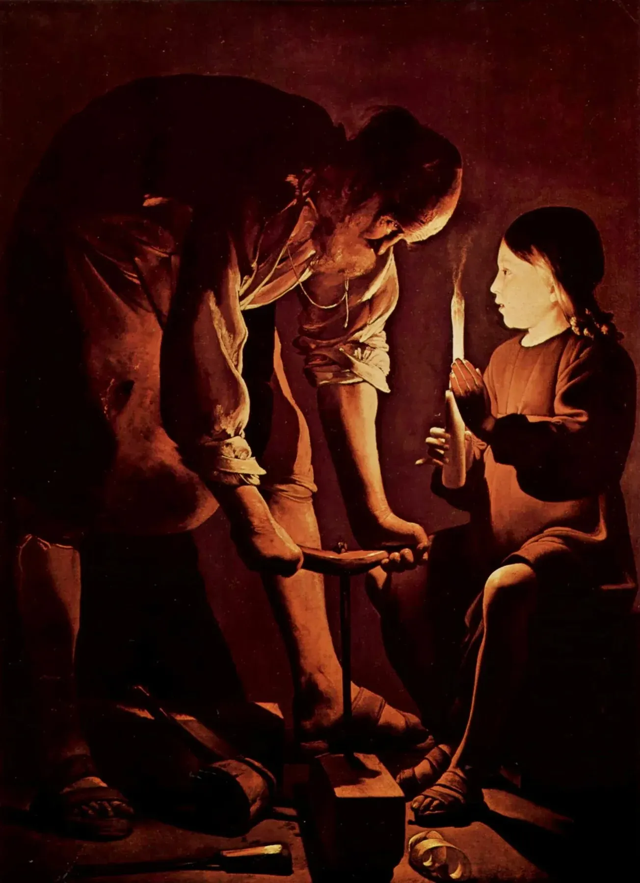
Georges de La Tour, Saint Joseph the Carpenter (1640s; also known as Christ in the Carpenter’s Shop) · Musée du Louvre, Paris · public domain · Wikimedia Commons
This analysis also had another use. There is an art historical claim that these paintings were traced by projecting an image with a lens or mirror, and the researchers note that both results align with previous analyses that have argued against that claim (DOI: 10.1117/12.806267). Another analysis examining the hand positions and left-right inversion of figures in 76 Caravaggio oil paintings concludes that this branch of evidence does not support the claim that optical projection was used (DOI: 10.1117/12.873187).
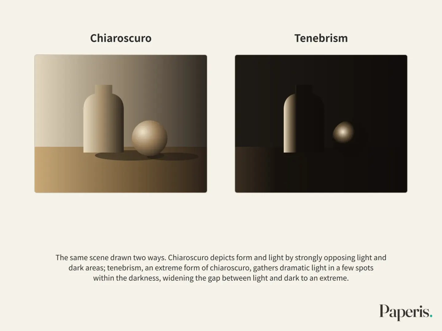
There is a name for the technique these paintings use. Chiaroscuro is a technique that depicts form and light by strongly opposing light and dark areas. The Italian word chiaroscuro ("light-dark") can also refer more broadly to the entire process of creating volume on a flat surface using light and dark gradations (Sachant et al., Introduction to Art ch. 2.04). This article calls the sequence of brightness created in that way shading, and calls the side that strongly opposes them chiaroscuro.
Contrast is the difference between light and dark areas within a single scene. One computational study views chiaroscuro as a device that increases contrast to highlight specific spots on the canvas and draw the eye there, and starting from that idea, created a metric using only brightness to measure "unexpected brightness changes" within the image. Measured with that metric, paintings by Caravaggio, La Tour, and the painter Rembrandt received higher values than 19th-century French Impressionist paintings, and Rembrandt's self-portraits showed higher values as he aged, excluding his later years. The researchers note that this trend matches art historians' interpretations (DOI: 10.1109/qomex.2016.7498932). This is a computational result measuring a collection of paintings with a single metric, and an attempt to translate art historical interpretations into numbers.
The method of pushing chiaroscuro to its limit is also called by a separate name. Tenebrism is an extreme form of chiaroscuro that gathers dramatic light in a few spots within the darkness, widening the gap between light and dark to an extreme. Caravaggio and painters who followed him painted with these very bright and very dark areas, and in Spanish painting, this approach was called tenebrism (DOI: 10.5040/9798400616532.169) (DOI: 10.5040/9798400616532.646). One theoretical text that categorizes painting strategies for handling light summarizes tenebrism as "dramatic emphasis gathered in the darkness" (DOI: 10.58945/cqwk8414). Chiaroscuro paintings establish bright areas by strongly opposing light and dark areas.
The Eyes First Guess That Light Comes From Above
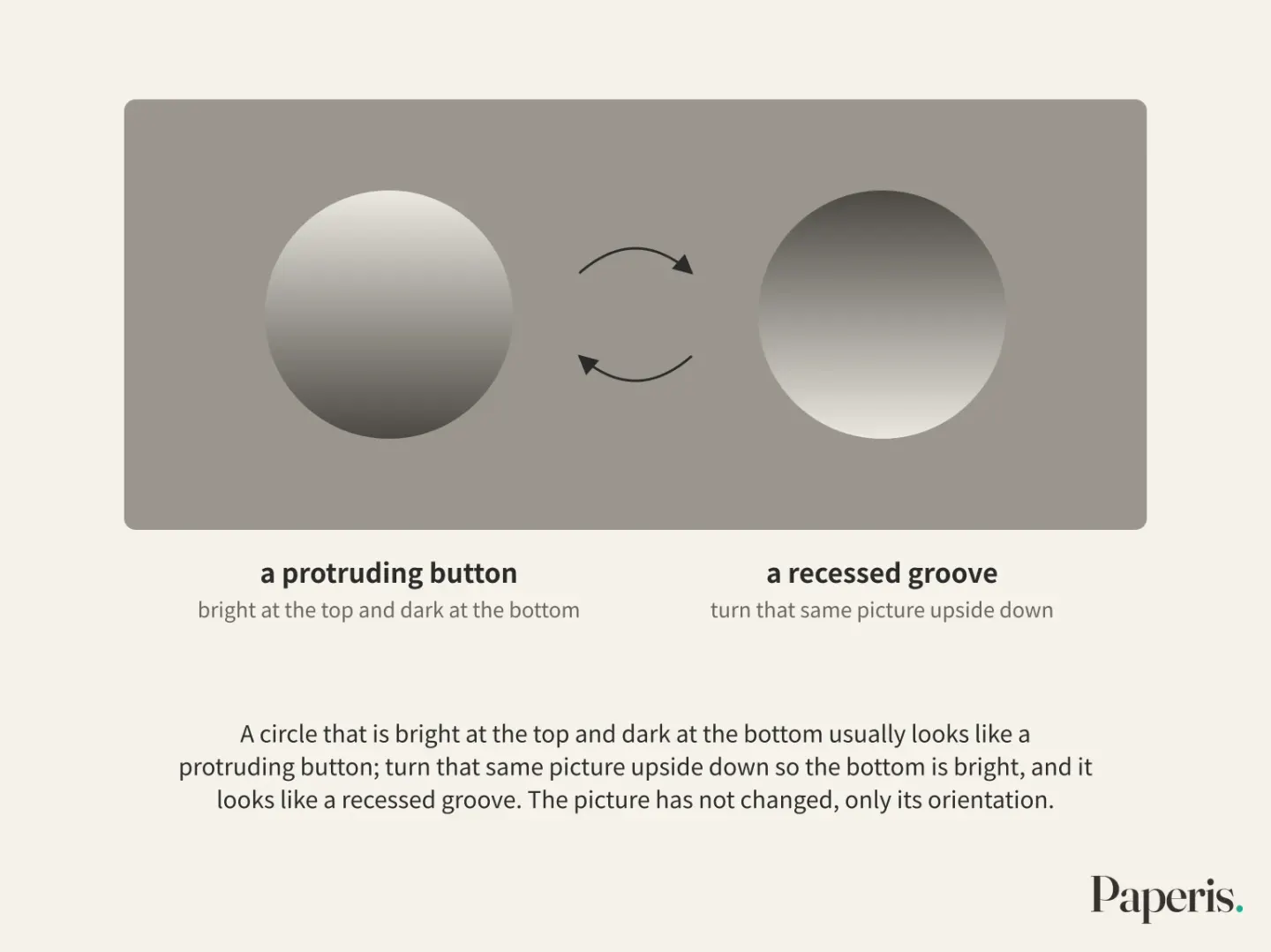
If you put a circle on a screen that is bright at the top and dark at the bottom, it usually looks like a protruding button, and if you turn that same picture upside down so the bottom is bright, it looks like a recessed groove (DOI: 10.1167/7.13.10). The picture has not changed, only its orientation. A single picture can match countless shapes, surface colors, and light arrangements, so shading alone does not determine a single answer (DOI: 10.1073/pnas.1100794108). The eyes fill in that blank with a guess.
The light-from-above assumption is the tendency of the eyes to first guess that light comes from above the head when shading is ambiguous. In various experiments, people tilted toward assuming light comes from slightly above and to the left rather than straight overhead (DOI: 10.1073/pnas.1006285107) (DOI: 10.1167/7.11.13). In an experiment asking participants to judge the shape of shaded hexagons, 18 children with autism and 18 children of similar age and intellectual ability both assumed, like adults, that the light came from the upper left, and they used this assumption to the same degree (DOI: 10.1016/j.jecp.2017.04.005).
The guess the eyes lean on is not just one. The convexity assumption is the tendency of the eyes to read an object as protruding first when its shape is ambiguous. These assumptions may be knowledge gained from a world where objects are usually protruding and light usually comes from above (DOI: 10.1167/10.8.6). In an experiment showing shaded ring-shaped stimuli to children aged 4 to 12 and adults, where the two assumptions conflicted, younger children followed the convexity side while older children and adults followed the light-from-above side (DOI: 10.1167/10.8.6). The researchers conclude that both assumptions form early but are reweighted during growth, which might be because convexity can be judged based on one's own body whereas light direction requires an external standard.
One study suggests this guess is weaker than thought (DOI: 10.1073/pnas.1100794108). Light comes from above only on average, and most scenes contain clues like shadows that signal slanted light. In that study, when the assumption and the light clues in the screen conflicted, the eyes blended the two and chose a direction in between, but the weight placed on the assumption was unexpectedly small so that even a barely noticeable light clue could overturn the assumption. The researchers conclude that the share this assumption plays in reading shape is much smaller than previously thought, and the eyes rely heavily on light clues (DOI: 10.1073/pnas.1100794108).
This guess can also be changed by laboratory training. When trained for a few hours by letting people touch real shapes and learn them, the apparent shape of shaded objects shifted to match the newly learned light direction. The researchers suggest that the moment one learns that an initial shape was wrong drives this readjustment (DOI: 10.1523/jneurosci.2749-10.2010). However, in another training experiment, signs of this assumption changing were found in a shape-judgment task, but it did not change in a task to quickly find an odd-one-out among many (DOI: 10.1167/7.13.10). When reading shading with ambiguous shapes, the eyes blend ordinary guesses and light clues from the screen, and with laboratory shapes, even barely noticeable clues could make them follow the clues.
The Light in Paintings Does Not Copy Actual Light All at Once
Paint cannot capture the entire difference between the brightest and darkest parts of a real scene (DOI: 10.1017/s0952523811000162). Yet paintings read well. In an experiment where faces in paintings and photographs were flashed for only 12 milliseconds, people distinguished faces from non-faces in both paintings and photographs with almost no errors. The researchers interpret this to mean that painters create representations that efficiently transmit perceptual information to the human brain (DOI: 10.1017/s0952523811000162).
The brightness that the eye feels does not simply rise and fall in direct proportion to the light intensity. Illusions in which the same gray looks different depending on its surroundings have long attracted interest without any universally accepted explanation, and the authors of one theoretical paper suggest that brightness perception is generated according to probabilities about where the light likely came from (DOI: 10.1037/0033-295x.111.1.142). Seeing the brightness of black, white, and gray surfaces is a difficult task because the image formed on the eye is deeply ambiguous in depth (DOI: 10.1146/annurev-vision-093019-115159).
Light in paintings is sometimes drawn according to established habits. In one conference abstract (a short presentation, not a full research paper) where four people marked the positions of highlights on wine glasses across 55 paintings and 55 photographs, the highlights in the paintings repeated in fixed positions with consistent patterns, whereas the highlights in the photographs varied in position and pattern. Round glasses like wine glasses generally had one highlight near the upper left of the rim and one bright spot where light gathered near the lower right in paintings. The highlights in paintings also showed higher agreement among the people who marked them (DOI: 10.1167/jov.21.9.1955). The researchers themselves note that this study covered only a narrow range of glossy objects.
Even highlights drawn by convention make the eye perceive gloss. In a study that had people evaluate the gloss of grapes in 17th-century paintings, the contrast and blurriness of the highlights could explain 69% of the variation in gloss evaluations, while the area covered by the highlight had no effect. This result matched the instructions for painting grape gloss published in a 1692 painting manual, and the researchers interpret that painting practices contain knowledge about which visual features produce gloss (DOI: 10.1167/19.3.7). Experiments outside of paintings point the same way. When actual balls inside a box were illuminated with altered highlight shapes, simple highlights borrowed from convention—such as the window shape in paintings, the ring shape in photographs, and circles and squares in cartoons—made them look shinier than complex highlight shapes, whether on a screen photograph or an actual ball (DOI: 10.1167/16.6.6). Even when highlights in paintings do not copy actual light in full and are drawn by convention, the eye perceives gloss from their contrast, blurriness, and shape. However, in one study, contrast and blurriness accounted for up to 69% of the variation in gloss evaluations.
Back in Front of the Painting
Now, imagine standing in front of a still-life painting in an art museum. There is a bunch of grapes and a glass on a table, with the top left of the canvas bright and the lower right growing darker.
First, we look at the shadows. If each grape is darker on the lower right and the dark patch on the table falls to the right, both the attached shadow and the cast shadow are telling us that the light is coming from the upper left. Shadows are clues that reveal the position of the light source within a painting (DOI: 10.1068/p130479) (DOI: 10.1117/12.806267).
Next, we pick one round grape and move our eyes from the bright side to the dark side. That path along which the value steps down across several levels creates the volume of the grape on a flat canvas (Sachant et al., Introduction to Art ch. 2.04).
Then, we find the brightest spot on the canvas. If the light and dark areas confront each other strongly, it is a painting on the side of chiaroscuro; if dramatic light is gathered in a few places within the darkness to push light and dark to extremes, it leans toward the extreme of tenebrism. Following the view of computational studies that see chiaroscuro as a device to gather the gaze, that bright spot may be the place the painter intended for you to see first (DOI: 10.1109/qomex.2016.7498932). Where the eye actually lingers first is continued in Composition and Gaze — Stepping Stones the Painting Lays, a Path the Eye Chooses.
Lastly, we look at the sheen. The white dots on the grapes and the glass may be convention-painted highlights, and the eye feels glossiness from them alone (DOI: 10.1167/jov.21.9.1955) (DOI: 10.1167/19.3.7).
In studies comparing people who draw with those who do not, people who draw performed better on shape analysis tasks, and that difference mostly moved together with drawing skill. However, empirical studies in this field are still few, and the explanation that knowledge of an object's structure and practiced hand movements shift attention to produce this difference is a model proposed by researchers (DOI: 10.1037/1931-3896.1.2.80).
Where to Look Next
To look deeply into a painting famous for its chiaroscuro, continue to Rembrandt's Night Watch — A Map of Paint, Drawn Inside a Glass Room. The method of layering thin coats of paint to build up light is covered in Girl with a Pearl Earring — Light Built in Layers, a Name Not Asked. How windows and curtains change the direction and intensity of light in a real room outside the painting is in Light — How One Window and One Curtain Change a Room.
Other parts of this series follow as well. For value and the phenomenon where surroundings make colors look pushed apart, go to Color — One Dab of Paint, Changed by Its Neighbors; for depth clues other than shading, go to Perspective and Space — The One Footprint a Picture Is Calculated For; for bright spots and eye movement, go to Composition and Gaze — Stepping Stones the Painting Lays, a Path the Eye Chooses; and for the layers in which paint is built up, go to Paint and Materials — The Same Powder, Different Doughs.
In multiple experiments, people chose to read ambiguous shading as light coming from above (usually slightly upper left) (DOI: 10.1167/7.11.13) (DOI: 10.1016/j.jecp.2017.04.005). When two assumptions clashed, young children even followed the convex side (DOI: 10.1167/10.8.6). And one study that measured how much weight this assumption holds when pitted against light cues in the image saw that its weight was smaller than expected (DOI: 10.1073/pnas.1100794108), and whether it is the same in other stimuli and tasks remains open.
Source Papers
- "Introduction to Art: Design, Context, and Meaning — 2.04 Form and Composition" (LibreTexts) — Sachant et al., Introduction to Art ch. 2.04 — The side facing the light source is bright and the side turned away is dark, and that transition creates the illusion of volume on a flat surface; chiaroscuro ("clear-dark") is used to mean the entire range of those light and dark steps, and overlapping lines create value.
- "Factors contributing to depth perception: behavioral studies on the reverse perspective illusion" (2008) — DOI: 10.1163/156856808784532518 — In depth-reversed stimuli, the cue that most strongly triggered the optical illusion was perspective grid lines, followed by shading and shadows, and then texture and color, an order similar to normal spatial perception in flat pictures.
- "Extending the Perception of Shape from Known to Unknown Shading" (1984) — DOI: 10.1068/p130479 — Light patterns (attached shadows) and cast shadows on clearly shaped forms alter the interpretation of ambiguous reliefs, and the position of the light source mediates how the relief inside the painting is interpreted.
- "Understanding gloss perception through the lens of art: Combining perception, image analysis, and painting recipes of 17th century painted grapes" (2019) — DOI: 10.1167/19.3.7 — Gloss evaluations of grapes in 17th-century paintings are 69% explained by highlight contrast and blurriness, while area has no effect, matching the instructions in a 1692 painting manual.
- "Estimating the position of illuminants in paintings under weak model assumptions: an application to the works of two Baroque masters" (2009) — DOI: 10.1117/12.806267 — The floor brightness in La Tour's paintings is a bit better explained by a single light source close to the candle, and the back wall of Caravaggio's The Calling of St Matthew points to a nearby light source a few meters outside the frame, matching prior objections to optical projection claims.
- "Did Caravaggio employ optical projections? An image analysis of the parity in the artist's paintings" (2011) — DOI: 10.1117/12.873187 — Examining the ratios and changes in figures' hand grips across 76 of Caravaggio's oil paintings does not support the claim that optical projections were used.
- "Computational modeling of artistic intention: Quantify lighting surprise for painting analysis" (2016) — DOI: 10.1109/qomex.2016.7498932 — Treating chiaroscuro as a device that draws attention, on a scale made from brightness alone, Caravaggio, La Tour, and Rembrandt score higher than 19th-century French Impressionists, and Rembrandt's self-portraits score higher with age except in his final years.
- "Chiaroscurist." (1996) — DOI: 10.5040/9798400616532.169 — A dictionary entry designating a painter who follows Caravaggio by painting in the very bright and very dark tenebrism style.
- "Tenebrismo." (1996) — DOI: 10.5040/9798400616532.646 — A dictionary entry noting a term derived from Spanish painting that used the extreme contrast of light and dark reminiscent of Caravaggio.
- "Светлината като концептуален и изобразителен материал: призмен метод за съвременното визуално изкуство" (2025) — DOI: 10.58945/cqwk8414 — A theoretical text that divides sfumato, chiaroscuro, and tenebrism into three ways of using light, categorizing tenebrism as dramatic emphasis gathered within darkness.
- "Modification of the convexity prior but not the light-from-above prior in visual search with shaded objects" (2007) — DOI: 10.1167/7.13.10 — Stimuli that are bright on top appear convex, and stimuli that are bright on the bottom appear concave; after visual and tactile training, the convexity assumption changed in visual search, but the light-from-above assumption showed traces of changing only in shape judgment and did not change in visual search.
- "The human visual system's assumption that light comes from above is weak" (2011) — DOI: 10.1073/pnas.1100794108 — All images match countless three-dimensional arrangements and are ambiguous; the eye blends the light-from-above assumption and light cues, but the weight of the assumption is so small that it is overturned even by barely noticeable cues, making the role of the assumption much smaller than expected.
- "Prior knowledge of illumination for 3D perception in the human brain" (2010) — DOI: 10.1073/pnas.1006285107 — People assume that light comes from slightly above and to the left of the head in ambiguous shading, and the early visual areas of the brain better predict the light source direction, while higher areas better predict the perceived shape.
- "Shape from shading: New perspectives from the Polo Mint stimulus" (2007) — DOI: 10.1167/7.11.13 — Even with ring-shaped stimuli, observers preferred stimuli illuminated from the left rather than the right, and the blurrier it was, the more they preferred the convex shape.
- "The light-from-above prior is intact in autistic children" (2017) — DOI: 10.1016/j.jecp.2017.04.005 — 18 autistic children and 18 comparison children both assumed an upper-left light source like adults, and to the same degree (introducing this assumption as a robust adult assumption).
- "Interactions between "light-from-above" and convexity priors in visual development" (2010) — DOI: 10.1167/10.8.6 — When the two assumptions clash in 4- to 12-year-olds and adults, young children follow convexity, while older children and adults follow light from above; both assumptions arise early but are reweighted as they grow.
- "Efficient Visual Recalibration from Either Visual or Haptic Feedback: The Importance of Being Wrong" (2010) — DOI: 10.1523/jneurosci.2749-10.2010 — Several hours of tactile feedback training changed the light-from-above assumption so that shape perception of shaded objects was adjusted to the new assumption.
- "Artistic representations: Clues to efficient coding in human vision" (2011) — DOI: 10.1017/s0952523811000162 — Paintings cannot reproduce the brightness range of real scenes, yet face discrimination in paintings and photographs was nearly perfect even at a 12-millisecond presentation, interpreted as artists creating expressions that efficiently convey perceptual information.
- "Perceiving the Intensity of Light." (2004) — DOI: 10.1037/0033-295x.111.1.142 — (Theoretical paper) Brightness perception is not simply proportional to light intensity and there is no universally accepted explanation for various illusions, with the authors viewing brightness perception as arising from probability distributions of possible causes.
- "Lightness Perception in Complex Scenes" (2021) — DOI: 10.1146/annurev-vision-093019-115159 — The brightness perception of achromatic surfaces is a difficult task due to deep retinal ambiguities, reviewing computational models over the past 20 years.
- "Painterly depictions of glasses display a stylized pattern of highlights" (2021) — DOI: 10.1167/jov.21.9.1955 — Four people marked the highlights of glassware in 55 paintings and 55 photographs; paintings had stylized patterns in fixed positions (upper-left rim highlight and light pooling at the lower right for round glasses) and were less ambiguous, whereas photographs varied widely, with the limitation that this is a narrow-scope study (conference abstract).
- "Highlight shapes and perception of gloss for real and photographed objects" (2016) — DOI: 10.1167/16.6.6 — Simple highlights taken from conventions (ring flashes in photographs, window shapes in paintings, cartoon circles and squares) made objects look glossier than complex shapes, and this was the same on screens and in real life.
- "Integrating art historical, psychological, and neuroscientific explanations of artists' advantages in drawing and perception." (2007) — DOI: 10.1037/1931-3896.1.2.80 — People who draw excel in visual analysis and shape recognition tasks, and most of that difference is explained by drawing skill, proposing an integrated model where empirical research is scarce and knowledge and motor practice shift attention.
Sources (23)
- Introduction to Art: Design, Context, and Meaning — 2.04 Form and Composition
- Factors contributing to depth perception: behavioral studies on the reverse perspective illusionDOI 10.1163/156856808784532518
- Extending the Perception of Shape from Known to Unknown ShadingDOI 10.1068/p130479
- Understanding gloss perception through the lens of art: Combining perception, image analysis, and painting recipes of 17th century painted grapesDOI 10.1167/19.3.7
- Estimating the position of illuminants in paintings under weak model assumptions: an application to the works of two Baroque mastersDOI 10.1117/12.806267
- Did Caravaggio employ optical projections? An image analysis of the parity in the artist's paintingsDOI 10.1117/12.873187
- Computational modeling of artistic intention: Quantify lighting surprise for painting analysisDOI 10.1109/qomex.2016.7498932
- ChiaroscuristDOI 10.5040/9798400616532.169
- TenebrismoDOI 10.5040/9798400616532.646
- Светлината като концептуален и изобразителен материал: призмен метод за съвременното визуално изкуствоDOI 10.58945/cqwk8414
- Modification of the convexity prior but not the light-from-above prior in visual search with shaded objectsDOI 10.1167/7.13.10
- The human visual system's assumption that light comes from above is weakDOI 10.1073/pnas.1100794108
- Prior knowledge of illumination for 3D perception in the human brainDOI 10.1073/pnas.1006285107
- Shape from shading: New perspectives from the Polo Mint stimulusDOI 10.1167/7.11.13
- The light-from-above prior is intact in autistic childrenDOI 10.1016/j.jecp.2017.04.005
- Interactions betweenDOI 10.1167/10.8.6
- Efficient Visual Recalibration from Either Visual or Haptic Feedback: The Importance of Being WrongDOI 10.1523/jneurosci.2749-10.2010
- Artistic representations: Clues to efficient coding in human visionDOI 10.1017/s0952523811000162
- Perceiving the Intensity of LightDOI 10.1037/0033-295x.111.1.142
- Lightness Perception in Complex ScenesDOI 10.1146/annurev-vision-093019-115159
- Painterly depictions of glasses display a stylized pattern of highlightsDOI 10.1167/jov.21.9.1955
- Highlight shapes and perception of gloss for real and photographed objectsDOI 10.1167/16.6.6
- Integrating art historical, psychological, and neuroscientific explanations of artists' advantages in drawing and perceptionDOI 10.1037/1931-3896.1.2.80