Paperis Articles
Space and Scale — The Seat with Its Back to the Wall, Facing the Window
What a building makes is the empty place its walls enclose, and that place is read through size measured against the body and through the relation of part to part. Some experiments link ceiling height and open views to how we think and feel, with many conditions attached; indoors, studies of places to hide more often came out neutral — and the evidence that the golden ratio is beautiful to everyone is thin.
Your field's papers, as audio
Pick your fields and journals — Paperis summarizes the key papers and turns them into audio. Listen on your commute.
Start Paperis free →Space and Scale — The Seat with Its Back to the Wall, Facing the Window
When You Open a Café Door and Choose a Seat
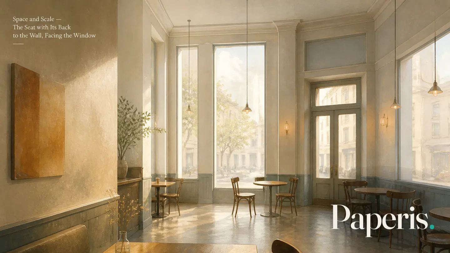
Let us imagine you push open the door of a café you are visiting for the first time. There are still only a few customers, so you can choose any seat. In the middle stands a table open on all sides, while in the deep corner is a spot where your back is blocked by a wall and you can see the entire shop, the entrance, and the vertically long windows lined up on the opposite wall in front of you. The ceiling is far up above your head.
Which seat catches your eye first differs from person to person. Even so, during that brief moment of choosing a seat, we weigh several things all at once. They are how large this room is, how high the ceiling is, how far we can see when seated, and whether our back is protected.
This article gives names to each of those considerations. And it follows what experiments can tell us about what each one does to a person. To say it in advance, what experiments tell us is less than we think and comes with many conditions attached.
The Empty Space Enclosed by Walls
The cafe you look around as you choose a seat is the first word of this article. Space is an empty place enclosed by walls, floors, and roofs, something both seen with the eyes and experienced with the body. (Ferreira, Introduction to Architecture ch. 3) Even in the same space, the range of what is visible differs depending on where you sit. Most of the latter part of this article is about that visible range and the size experienced by the body.
A Size Compared to the Body
When an adult walks into a kindergarten classroom, they suddenly feel as though their body has grown larger. This is because of the chairs that reach near the knees and the washbasins placed below the waist. The room remains the same, but the body measuring that room has changed.
Scale is the size of a building or its parts compared to the human body and its surroundings. (Ferreira, Introduction to Architecture ch. 3) The length measured by a ruler is the same no matter who measures it, but scale changes depending on what it is compared to.
There is an architectural theory text that pushes the idea that size is a matter of the body further. It suggests that we feel the size of an object by how our moving body can handle it. A mountain is large because it cannot be seen all at once up close and takes a great deal of effort to climb. A dollhouse is small because one can look down at the furnishings inside all at once and move them by hand (DOI: 10.1017/s135913550999008x). This text is not an experiment, but a reflection that emerged from a design studio.
Because scale is size compared to the body, a ceiling of the exact same height is read as a different scale if the body it is compared to changes. Saying a room is large or small is a statement about the room, but it is also a statement about the body standing in that room.
Parts and the Whole
Let us return to the vertically long window of a cafe. Even with the same glass area, you can make the window narrow and tall, or flat and wide at waist height. Even if the window area is the same, if the shape of the window compared to the entire wall changes, the same wall takes on a different face.
Proportion is the size relationship between parts and parts, and parts and the whole, within a single building. (Ferreira, Introduction to Architecture ch. 3) The relationship between the window and the wall we saw earlier is precisely proportion.
An old promise has long accompanied proportion. It is the idea that there is a separately established beautiful ratio, and that following that ratio makes something look pleasing to anyone. Among them is the most famous ratio. The golden ratio is a ratio obtained by dividing a length into two such that the ratio of the long side to the short side is equal to the ratio of the whole to the long side, which is roughly 1.6 to 1. The idea that shapes structured with this ratio look the most pleasing is called the golden ratio hypothesis (DOI: 10.2307/1422725).
The Most Famous Proportion, Conflicting Experiments
The golden ratio hypothesis has been put to the test for a century and a half. It was first examined in 1876 by the German scholar Gustav Fechner, who sought to confirm through experiment the contemporary claim that the golden ratio determines the beauty of great works of art. His experiment is still frequently cited as evidence for the golden ratio, but experiments accumulated over the century that followed suggest that the golden ratio plays a small part in determining people's rectangle choices (DOI: 10.1037/a0017316).
There are experiments on the pro side as well. In a 1978 experiment where 120 people were shown seven rectangles of similar area paired in twos, the golden ratio rectangle and those surrounding it were chosen more often (DOI: 10.2466/pms.1978.46.3.831). In another experiment from 1976, golden ratio-adjacent rectangles were chosen from sets of rectangles matched for area, but when the size increased alongside the ratio change, simply the largest rectangle was chosen (DOI: 10.2307/1421471).
Experiments on the anti side cast doubt on the selection board itself. In a 1976 experiment where 90 people were shown sets of rectangles while a golden ratio rectangle was placed alternately near one end of the set, in the middle, or near the other end, people chose the rectangles at both ends of the set before the golden ratio. The golden ratio was chosen most often only in the condition where they were nudged toward the golden ratio in a preceding task. Demand characteristics are clues in experimental procedures that make participants guess what the experiment wants and answer accordingly. The authors concluded that the preference for the golden ratio did not stem from the beauty of the rectangle itself, but was the result created by the range of rectangles shown and demand characteristics (DOI: 10.2466/pms.1976.43.1.47). It has also been pointed out that having participants rank a given set yields no meaningful results. In the experiment of a 1980 paper containing that critique, about half of the participants simply ranked the rectangles in order of increasing ratio. In the same paper, ellipses drawn directly by people had the most ratios near the golden ratio, but there was a similar skew in the length of the drawings, leading the author to consider that such group preferences would not have great aesthetic significance (DOI: 10.2307/1422725).
Recent experiments are also divided. In an experiment where objects were placed in golden ratio positions or in the middle within actual paintings, there was no clear preference for the golden ratio either in conscious evaluation or in automatic responses arising without time to think (DOI: 10.1037/a0038506). In another 2024 experiment involving 100 people, golden ratio shapes were paired more quickly with positive words in automatic responses, but direct ratings were mixed (DOI: 10.3390/sym16030333). In a 2021 online experiment where 256 people were asked to choose one of three ratios, the golden ratio was chosen 53% of the time, which the authors recorded as a slight preference (DOI: 10.1002/pchj.505).
The most solid-looking results lie on the other side. A 2010 experiment measuring the rectangle choices of 79 people reproduced the results of a rectangle preference study published by researcher McManus in 1980. Although the group-level preference was weak, individual people had clear and stable preferences for which rectangles they liked, and those preferences varied widely from person to person. Various individual difference scales, including personality, had no correlation whatsoever with those differences, so why they differ remains unexplained (DOI: 10.1037/a0017316).
The evidence that the golden ratio is universally beautiful is weak, and the result that people's preferred rectangles differ distinctly from person to person is more solid. All of these experiments used rectangles and pictures on paper or screens. Experiments comparing proportions while walking inside a building are not among the evidence gathered in this article. The eye for proportion is useful, but what that eye seeks is not a single correct ratio.
Height Above the Head
Let's turn our eyes to the high ceiling of a café. Across three studies that varied ceiling height, a high ceiling brought to mind freedom, and a low ceiling brought to mind confinement. Accordingly, the ways people processed information also differed. People on the high-ceiling side tended to group multiple pieces of information together and think abstractly, while those on the low-ceiling side leaned toward examining things concretely, one by one. The researchers considered this difference to appear when the ceiling was sufficiently noticeable, and three studies supported that idea (DOI: 10.1086/519146).
Results like this are easy to shorthand and translate as "a high ceiling makes you creative." What the research measured was whether people viewed information bundled together or itemized piece by piece, and neither creativity scores nor work performance appear in the abstract. The grade of the evidence must also be looked at together. The three studies belong to a single research team that studied consumer behavior, and whether other research teams obtained the same results again is not within the evidence collected by this article.
There are experiments showing that ceiling height touches the way we think, but these are results from a single research team and are conditional on the ceiling being noticeable.
A Room That Looks Spacious, A Room That Is Actually Spacious
A room of the same size feels spacious on some days and cramped on others. Spaciousness is the feeling of how wide and open a room appears, regardless of its actual size.
Spaciousness is pulled and moved by various things besides size. In rooms shown through virtual reality, the brighter the ceiling was made, the taller the room appeared, and making the walls brighter also made it appear taller. The brightness of the floor made no difference. This result was not explained by the difference in brightness between the ceiling and walls alone (DOI: 10.1080/17470211003646161). When furniture was brought into scale-model rooms, the room appeared taller but less spacious. In a second experiment showing rooms with different floor areas through virtual reality, the furniture made no difference, and the authors listed the medium of presentation as one of the candidate reasons (DOI: 10.1371/journal.pone.0113267).
The same conditions are sometimes read in reverse depending on the person. In a 1980 survey of students in high-rise dormitories, the view outside the window itself had no relation to the feeling that the room was spacious, whereas which floor the room was on did. Female students felt the room was more spacious the higher the floor, and male students showed the opposite (DOI: 10.1177/0013916580123002).
What the feeling of spaciousness leads to must also be read with caution. In a survey published in 2008 of 559 mothers across nine maternity wards in the UK, the degree to which they felt the room was spacious was strongly associated with satisfaction with the facilities and satisfaction with the care received. However, the degree to which they felt they could move their bodies or move furniture during labor had no relation to the overall size of the room (DOI: 10.12968/bjom.2008.16.2.28344). What the survey showed was an association that moved together, and it does not mean that a spacious room produced satisfaction. In an experiment simulating a criminal suspect interview using virtual reality, neither the size of the room nor the distance sitting across from each other made a difference in the amount of information disclosed. Only in an exploratory secondary analysis did people interviewed in a larger room report feeling the room was more spacious and connecting better with the interviewer (DOI: 10.1111/lcrp.12156).
There are several experiments that found conditions making a room look spacious, but certain conditions disappeared or flipped depending on the method of presentation or the viewer.
As Much as You Can See from One Spot
If you sit in the corner of a café, the whole shop and the door come into view at a glance. If you sit right in the middle, you can see ahead, but not behind your back. The range you can see differs with every seat.
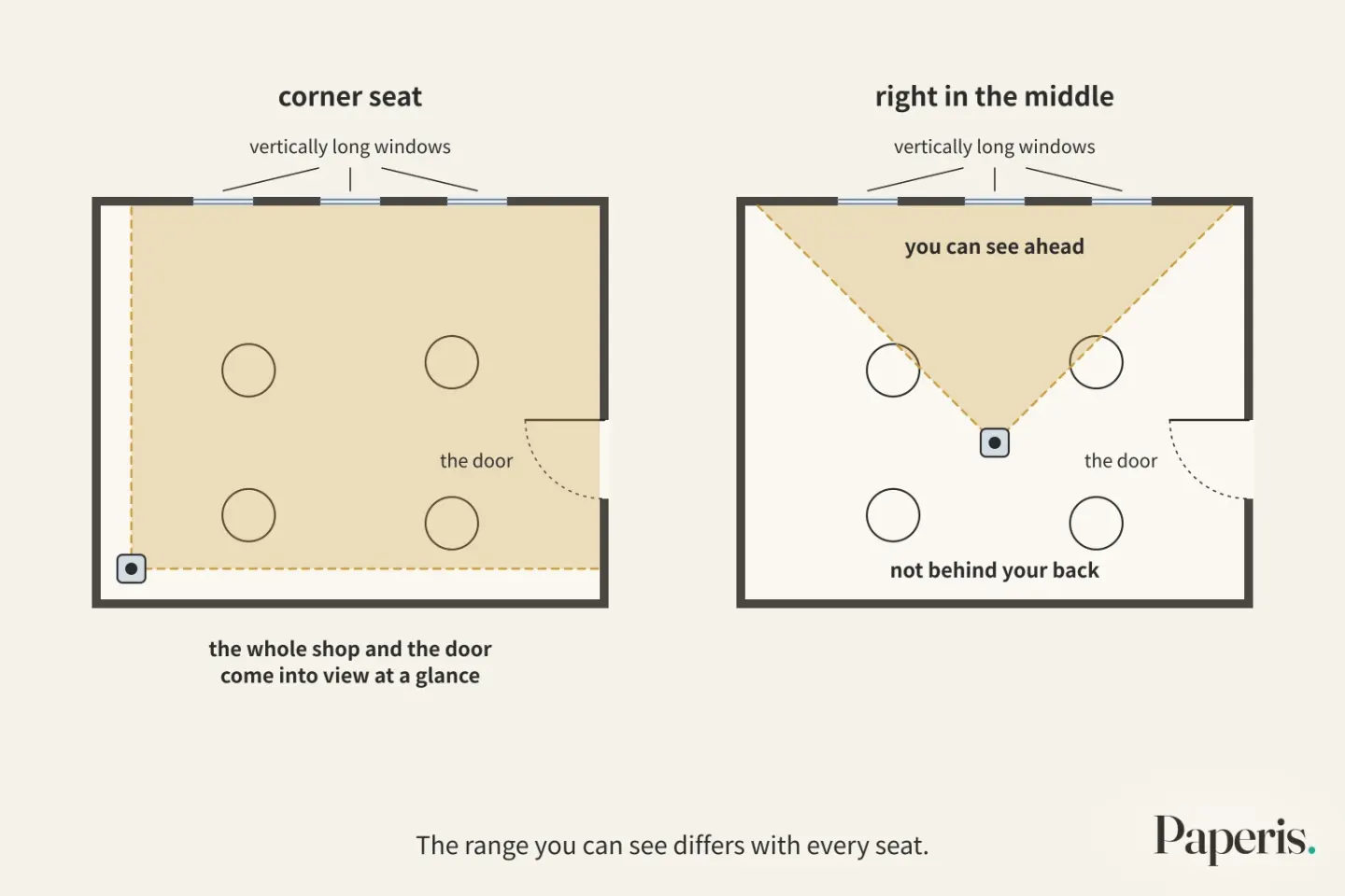
An isovist is a shape drawn of the visible range when you stand in one spot and look around, commonly drawn on top of a floor plan. When you measure the area and shape of that figure in numbers, you can compare how different spots inside a building look and feel (DOI: 10.1080/13602365.2014.965722). Because it is a way to lift off the space visible from a single point as a drawing, it is also used in research that sorts out the different experiences of space by architectural style using machines (DOI: 10.52842/conf.acadia.2017.474).
There are also results showing that these numbers move together with feelings. In a 2024 study where 713 people evaluated 36 virtual office models, layouts where the visible range was round and gathered together received higher ratings for being beautiful and pleasant, while layouts where the visible range scattered in all directions yielded lower feelings of safety. People reported feeling safer and less disturbed the taller the partitions were (DOI: 10.1016/j.buildenv.2024.111928). These were evaluations made by looking at offices on a screen, and it is a correlation showing that numbers and feelings moved together.
A Place to Look Out and A Place to Hide
It is the corner seat again. The back is blocked by a wall, and ahead, the shop and the street can be seen from a distance. Prospect and refuge are a pair of properties for reading space; prospect is the property of being open in front so one can see far into the distance, and refuge is the property of being enclosed at the back and around so one can hide the body. The prospect-refuge theory holds that people feel comfortable in a place that has both of these together. In architecture and interior design, a trend has grown to accept as desirable a balance that adds complexity and mystery to these two (DOI: 10.1186/s40410-016-0033-1).
There is a review that gathered quantitative studies testing this theory, dividing them into support, opposition, and neutrality. The authors aimed to classify the results rather than scrutinize the rigor of each study. Natural landscape studies supported both prospect and refuge, but there were also opposing and neutral results. Complexity was preferred to some extent indoors, but how much and where it should be was unclear, and mystery mostly yielded neutral or opposing results. The conclusion of the authors is that the quantitative evidence for this theory is patchy (DOI: 10.1186/s40410-016-0033-1).
In indoor and urban studies, results showed that the side where one can see out is important, and the hiding place side had more neutral results (DOI: 10.1186/s40410-016-0033-1). The authors particularly took issue with the fact that the results most frequently cited in architecture came from natural landscape studies rather than indoor or urban ones.
There is also a study that measured the houses of an architect whose work is frequently summoned by this theory. Critics have found the reason American architect Frank Lloyd Wright’s houses are alluring in the balance of prospect, enclosure, and mystery. When a study calculated isovists along the walking paths through five houses built by Wright (it did not measure human responses), the traces of that balance were there, but fell short of being uniquely Wright's or particularly prominent (DOI: 10.1080/13602365.2014.965722).
Back at the Cafe Door
Now let's return to the opening scene. When we open the door and step inside, a space enclosed by walls and ceiling greets us. We read the scale of the room by comparing our bodies to the chair at knee height and the table where our elbows rest. The vertically long window and the wall pierced by that window are read as proportion. Whether that ratio fits the golden ratio cannot be judged as good or bad by the experiments this article looked at.
The high ceiling stands out. There is a finding by one research team that people lean toward binding thoughts under a high ceiling, and the researchers saw that this difference appears when the ceiling is sufficiently noticeable. There is also a virtual reality experiment showing that brightly painted ceilings and walls made the room look taller. However, certain conditions for the feeling of spaciousness varied depending on how it was presented or who was looking.
The corner seat has a wide field of view, and its back is blocked by a wall. Prospect-refuge theory tries to explain the reason this spot is drawn to with that pair. What indoor evidence supports reaches only as far as the side that can be looked out upon. Toward the hiding place side, neutral results were more common in indoor studies.
The eye that looks at buildings is an eye that notices these deliberations and calls them by name. It is different from the work of memorizing correct dimensions or correct ratios.
Where to Look Further
Buildings where walls no longer bear weight, allowing rooms to open wide and exterior walls to empty into glass, continue in "Mies van der Rohe — Give the Weight to the Frame, Empty the Walls into Glass". How a single round void was covered with Roman concrete is covered by "The Pantheon — A Cracked Bowl That Stands as Arches", and how another house built by Wright in this article stands is handled in "Frank Lloyd Wright — A Floor Thrust Out over the Falls, and the Cables That Caught It Again". How the walls and floors surrounding a space endure leads to "Building Materials — The Chalk That Snaps, the Paper Clip That Bends".
In the same series, light entering through windows and glare are continued in "Light — How One Window and One Curtain Change a Room", the color and texture of walls and ceilings and the echo of a room in "Material and Texture — A Wall the Fingertips Know, a Room That Returns a Clap", and the paths from room to room and the uses of the building in "Paths and Use — A Newcomer's Steps, an Occupant's Word".
Source Papers
- "Introduction to Architecture — 3 Elements of Architecture" (Kelsey Ferreira, Open Oregon) — Ferreira, Introduction to Architecture ch. 3 — Scale is size compared to the surroundings and the human body, proportion is the relationship between parts and the whole, and space is both something seen and something experienced.
- "'Worlds in Miniature': some reflections on scale and the microcosmic meaning of cabinets of curiosities" (2009) — DOI: 10.1017/s135913550999008x — Theoretical reflections from a design studio. The size of an object is perceived by whether a moving body can handle it (mountains vs. dollhouses).
- "The Golden Section Hypothesis" (1980) — DOI: 10.2307/1422725 — The definition of the golden ratio (roughly 1.618), methods of ranking predetermined sets yield no meaningful results with about half of participants in one experiment ordering them by the ratio, and while the mode of 515 drawn ellipses was near the golden ratio, there was a similar pull toward length so group preference has little aesthetic significance.
- "Beyond the Golden Section and normative aesthetics: Why do individuals differ so much in their aesthetic preferences for rectangles?" (2010) — DOI: 10.1037/a0017316 — A century of experiments suggests a small normative role for the golden ratio, re-confirming McManus's (1980) results in 79 people — group preferences are weak while individual preferences are strong, stable, and diverse, and uncorrelated with measures of individual differences.
- "The Golden Section: The 'True' Ratio?" (1978) — DOI: 10.2466/pms.1978.46.3.831 — Pairwise comparison of seven rectangles of similar area by 120 people, showing a preference for the golden ratio and its vicinity.
- "The 'Golden Rectangle': Some New Data" (1976) — DOI: 10.2307/1421471 — In sets of equal area, preference is near the golden ratio; in sets where size varies with the ratio, larger rectangles are preferred.
- "The 'Golden Section': An Artifact of Stimulus Range and Demand Characteristics" (1976) — DOI: 10.2466/pms.1976.43.1.47 — 90 people; rectangles at the ends of the stimulus range were chosen first, and the golden ratio was maximized only under reinforcement conditions, leading to the conclusion that golden ratio preference is an artifact of stimulus range and demand characteristics.
- "Time to let go? No automatic aesthetic preference for the golden ratio in art pictures." (2015) — DOI: 10.1037/a0038506 — Neither explicit nor implicit evaluations of real pictures show a golden ratio preference, casting doubt on its universality.
- "Implicit and Explicit Preferences for Golden Ratio" (2024) — DOI: 10.3390/sym16030333 — 100 people; golden ratio + positive word pairs were faster and more accurate in an implicit association task, but explicit evaluations were mixed.
- "The golden ratio as an ecological affordance leading to aesthetic attractiveness" (2021) — DOI: 10.1002/pchj.505 — 256 online participants; among the golden ratio, 1.5, and 1.8, the golden ratio received a slight preference of 53%.
- "The Influence of Ceiling Height: The Effect of Priming on the Type of Processing That People Use" (2007) — DOI: 10.1086/519146 — Three studies in which researchers theorized that when ceilings are sufficiently prominent, high ceilings evoke freedom and low ceilings evoke confinement, prompting relational and item-specific processing respectively, with three studies supporting this.
- "Surface Lightness Influences Perceived Room Height" (2010) — DOI: 10.1080/17470211003646161 — Two virtual reality experiments; the lighter the ceiling and walls, the higher they appeared, while the floor was irrelevant, and contrast alone does not explain this.
- "The Effect of Furnishing on Perceived Spatial Dimensions and Spaciousness of Interior Space" (2014) — DOI: 10.1371/journal.pone.0113267 — Experiment 1 (scaled model with a square floor) showed that furniture made rooms appear taller but less spacious, while Experiment 2 (rooms with varying floor areas in virtual reality) showed no difference, with potential causes such as media discussed.
- "Room Utilization and Dimensions of Density: Effects of Height and View" (1980) — DOI: 10.1177/0013916580123002 — Survey of high-rise dormitories; the feeling of spaciousness was related to floor height rather than the view outside, with female students feeling more spaciousness on higher floors and male students showing the reverse.
- "Maternity unit design study part 2: perceptions of space and layout" (2008) — DOI: 10.12968/bjom.2008.16.2.28344 — Survey of 559 mothers across 9 UK sites; the feeling of spaciousness was linked to facility and care satisfaction, while the feeling of being able to move around was independent of room size.
- "The influence of room spaciousness on investigative interviews" (2019) — DOI: 10.1111/lcrp.12156 — Virtual reality suspect interviews; room size and seating distance were unrelated to information disclosure, though exploratory analyses showed that larger rooms felt more spacious and had higher rapport.
- "Testing the 'Wright Space': using isovists to analyse prospect-refuge characteristics in Usonian architecture" (2014) — DOI: 10.1080/13602365.2014.965722 — Five Wright houses analyzed using isovists; there is some evidence of patterns, but not enough to consider them unique to Wright or particularly prominent.
- "Machines' Perception of Space: Employing 3D Isovist Methods and a Convolutional Neural Network in Architectural Space Classification" (2017) — DOI: 10.52842/conf.acadia.2017.474 — Representing space with three-dimensional isovists from a single observation point and classifying spatial experiences by style.
- "Designing affective workplace environments: The impact of typology, contour, ceiling and partition height on cognitive and aesthetic appraisal" (2024) — DOI: 10.1016/j.buildenv.2024.111928 — 36 virtual offices and 713 people; high partitions meant safety and less distraction, curves were more beautiful, and isovist compactness and circularity correlated positively with beauty while variance correlated negatively with safety.
- "Evidence for prospect-refuge theory: a meta-analysis of the findings of environmental preference research" (2016) — DOI: 10.1186/s40410-016-0033-1 — Quantitative research findings classified as pro, con, or neutral (not a rigor assessment); urban and indoor environments support prospect support while refuge is neutral, natural environments support both while some oppose, mystery is mostly neutral or opposing, evidence is inconsistent, and results frequently cited in architecture stem from natural environment research.
Sources (20)
- Introduction to Architecture — 3 Elements of Architecture
- 'Worlds in Miniature': some reflections on scale and the microcosmic meaning of cabinets of curiositiesDOI 10.1017/s135913550999008x
- The Golden Section HypothesisDOI 10.2307/1422725
- Beyond the Golden Section and normative aesthetics: Why do individuals differ so much in their aesthetic preferences for rectangles?DOI 10.1037/a0017316
- The Golden Section: The 'True' Ratio?DOI 10.2466/pms.1978.46.3.831
- The 'Golden Rectangle': Some New DataDOI 10.2307/1421471
- The 'Golden Section': An Artifact of Stimulus Range and Demand CharacteristicsDOI 10.2466/pms.1976.43.1.47
- Time to let go? No automatic aesthetic preference for the golden ratio in art picturesDOI 10.1037/a0038506
- Implicit and Explicit Preferences for Golden RatioDOI 10.3390/sym16030333
- The golden ratio as an ecological affordance leading to aesthetic attractivenessDOI 10.1002/pchj.505
- The Influence of Ceiling Height: The Effect of Priming on the Type of Processing That People UseDOI 10.1086/519146
- Surface Lightness Influences Perceived Room HeightDOI 10.1080/17470211003646161
- The Effect of Furnishing on Perceived Spatial Dimensions and Spaciousness of Interior SpaceDOI 10.1371/journal.pone.0113267
- Room Utilization and Dimensions of Density: Effects of Height and ViewDOI 10.1177/0013916580123002
- Maternity unit design study part 2: perceptions of space and layoutDOI 10.12968/bjom.2008.16.2.28344
- The influence of room spaciousness on investigative interviewsDOI 10.1111/lcrp.12156
- Testing the 'Wright Space': using isovists to analyse prospect-refuge characteristics in Usonian architectureDOI 10.1080/13602365.2014.965722
- Machines' Perception of Space: Employing 3D Isovist Methods and a Convolutional Neural Network in Architectural Space ClassificationDOI 10.52842/conf.acadia.2017.474
- Designing affective workplace environments: The impact of typology, contour, ceiling and partition height on cognitive and aesthetic appraisalDOI 10.1016/j.buildenv.2024.111928
- Evidence for prospect-refuge theory: a meta-analysis of the findings of environmental preference researchDOI 10.1186/s40410-016-0033-1