Paperis Articles
Mondrian — Would You Notice If the Lines Moved a Little?
Experiments that compared Mondrian's originals with versions whose lines were shifted, paintings rotated or colour patches swapped. In paired choices the originals were reliably distinguished; rated one at a time, tilted versions scored lower and the original orientation higher. But the tasks differed, the abstracts give no effect sizes, and people found the intended orientation harder to identify for some paintings.
Your field's papers, as audio
Pick your fields and journals — Paperis summarizes the key papers and turns them into audio. Listen on your commute.
Start Paperis free →Mondrian — Would You Notice If the Lines Moved a Little?
A White Background, Black Lines, and a Few Colored Boxes
The Dutch painter Piet Mondrian (1872–1944) spent his mature period drawing black horizontal and vertical lines on a white background, and painting only a few of the spaces divided by those lines in red, yellow, and blue (DOI: 10.31234/osf.io/n6cf7). Mondrian gave these paintings from 1921 to 1939 the name "Neo-Plasticism Abstract." One research team separately gathered and analyzed 55 paintings chosen as typical of this period from the catalog of his complete works (DOI: 10.1167/14.10.653). There are no recognizable shapes of what is being depicted, leaving only lines and colored boxes.
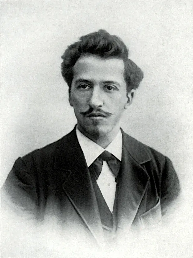
Piet Mondrian, photograph 1899 (photographer unknown) · Kunstmuseum Den Haag · public domain · Wikimedia Commons
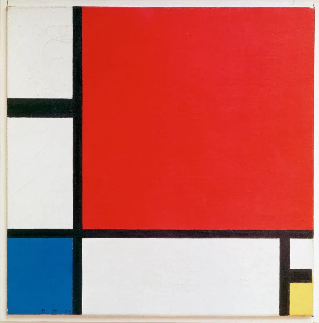
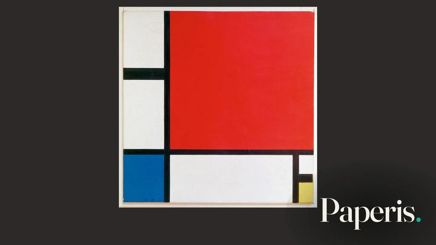
Piet Mondrian, Composition II in Red, Blue and Yellow (1930) · Kunsthaus Zürich · public domain · Wikimedia Commons
Standing in front of such a painting, the thought "I could draw a few lines like that myself" might cross your mind. This article turns that thought into a testable question and follows along. If Mondrian's drawn lines are shifted slightly, if the colors of the colored boxes are swapped, or if the painting is hung rotated, will viewers notice the difference? Experiments placing formless paintings side by side with drawings made by children or animals were covered in "Abstract Art and Children's Paintings — Between the Fridge Door and the Gallery Wall," and this article leaves those aside to focus solely on Mondrian's original works and modified versions of them.
Composition refers to how elements within a painting—such as lines, shapes, and colors—are arranged within the frame. Because Mondrian's paintings use simple materials, they are easy to redraw on a computer screen, allowing participants to move lines directly on the screen, which is why they were used as material for experimenting with composition (DOI: 10.31234/osf.io/n6cf7). A variant is a painting recreated by changing just one thing from the original: the positions of the lines, the placement of the colors, or the hanging orientation. Most of the experiments below used Mondrian's originals and variants as materials, but the presentation methods and the tasks given to the people differed. These are experiments where two pictures were shown as a pair and one had to be chosen, where pictures were shown one by one and rated for how pleasing they looked, where a single picture was shown and lines had to be moved to recreate it, where participants were asked to point out where the visual weight of the painting seemed anchored, and where they had to guess the orientation chosen by the artist. These five measure different things.
When Paired with Fakes That Shift All the Lines Slightly
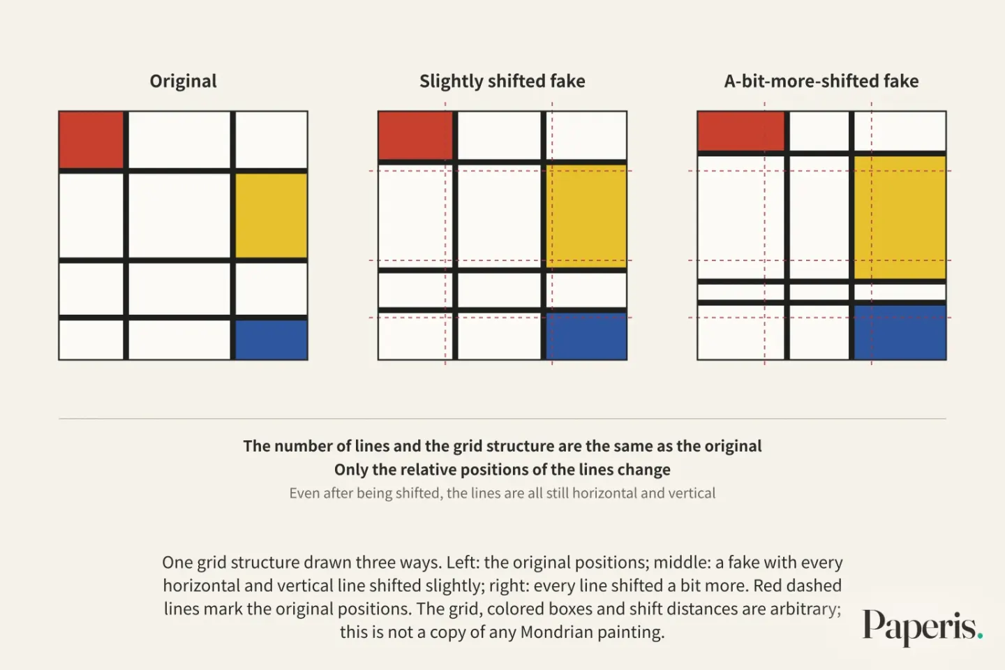
Researchers I. C. McManus and Paul Gladston redrew 25 original Mondrian paintings on a computer screen. And for each painting, they created two fake Mondrians. One had all the horizontal and vertical lines in the painting randomly shifted slightly, and the other had them all shifted a bit more. The number of lines and the grid structure are the same as the original, and only the relative positions of the lines change. Even after being shifted, the lines are all still horizontal and vertical. Participants looked at the original and the slightly shifted fake, the original and the a-bit-more-shifted fake, and the two fakes paired together, and chose one of the two. With three pairs for each of the 25 paintings, one person made 75 choices (DOI: 10.31234/osf.io/n6cf7).
A total of 277 people participated across five studies. The research team noted that the originals were reliably distinguished from the fakes, and that there were people who sensed the difference better and those who sensed it less (DOI: 10.31234/osf.io/n6cf7). Because this result is the abstract of a poster presented at a design conference in 2014, it is evidence at the conference presentation stage. The abstract does not state what percentage of judgments successfully identified the original, or how the results differed between the slightly shifted fake and the a-bit-more-shifted fake.
The scope of what this result says is as follows. Even when paired with fakes where all the horizontal and vertical lines were shifted slightly to keep the grid structure the same and change only the positions, the originals were reliably distinguished from the fakes in the judgments of 277 people. Since the research team wrote directly that the degree of sensing that difference varied from person to person, this result does not lead to the claim that "anyone recognizes the original every time."
When You Have Them Move the Lines Directly
Gustav Theodor Fechner, the German scholar who founded experimental aesthetics, wrote in an 1876 book about three ways to ask about beauty. There was the method of having people look at several similar things and choose one, the method of having them modify something themselves until they liked it, and a third method he called the "method of use." Later experiments mostly used the choice method (DOI: 10.31234/osf.io/n6cf7).
McManus and Geshick tried the making method on Mondrian's work as well. A single Mondrian painting appeared on the screen, and when participants moved the mouse, horizontal lines, vertical lines, or both moved up and down or sideways. Several lines in the same direction moved together as a bundle, and the lines could not cross over one another. This was a setup that kept the grid structure the same while changing only the proportions, and the original arrangement was always one of the choices available. This experiment used 39 original paintings that did not overlap with the previous 25, and 84 participants did both the choosing and the making. The order of the two methods was determined at random, and the order did not affect the results (DOI: 10.31234/osf.io/n6cf7).
The result the researchers noted as most striking was the difference between the two methods. The same 84 people clearly preferred the originals over fakes in the choice method, but in the making method, there was no evidence that the pictures they created resembled the originals overall (DOI: 10.31234/osf.io/n6cf7). The researchers found the reason in the task itself. The cursor always started from one of the four corners, and many participants finished making their decisions at the edges or limits of the adjustable range, with most looking over only a small fraction of the possible arrangements before deciding. The researchers proposed viewing the difficulty of the making method as a limit of visual working memory. The idea is that people cannot hold several of the earlier images in their heads and compare them to the picture on the screen right now, whereas the choice method carries no such burden at all.
If you isolate just the making results, it is easy to read it as "people do not know Mondrian's arrangements," yet when the same people chose, they preferred the originals, and the researchers saw the making results as a burden of the task. If you look only at the choice results, it is easy to read it as "people know the original arrangements," yet there was no evidence that the pictures they made themselves grew closer to the originals. When the method of asking the same people was changed, the answers came out differently. However, the paintings used in the two methods were different from each other. The phenomenon where the way of asking shifts the answer also happened with the proportions of rectangles, which we covered in "The Golden Ratio — Answers That Moved with the Question, a Different Rectangle for Each Person".
When Paintings Are Hung at an Angle
Among Mondrian's paintings, there are some whose frames are tilted diagonally and hung as lozenges. Researcher Latto and colleagues selected eight Mondrian paintings. Four are paintings whose original frames are placed horizontally and vertically, and four are paintings whose original frames are diagonal lozenges. The research team showed one plate rotated in eight directions for each painting, and had participants rate how pleasing it was on a scale from 1 to 7 (PMID 11145089). Since the same painting appears multiple times with only its orientation changed, the design allows a comparison of how much each individual direction changes the score.
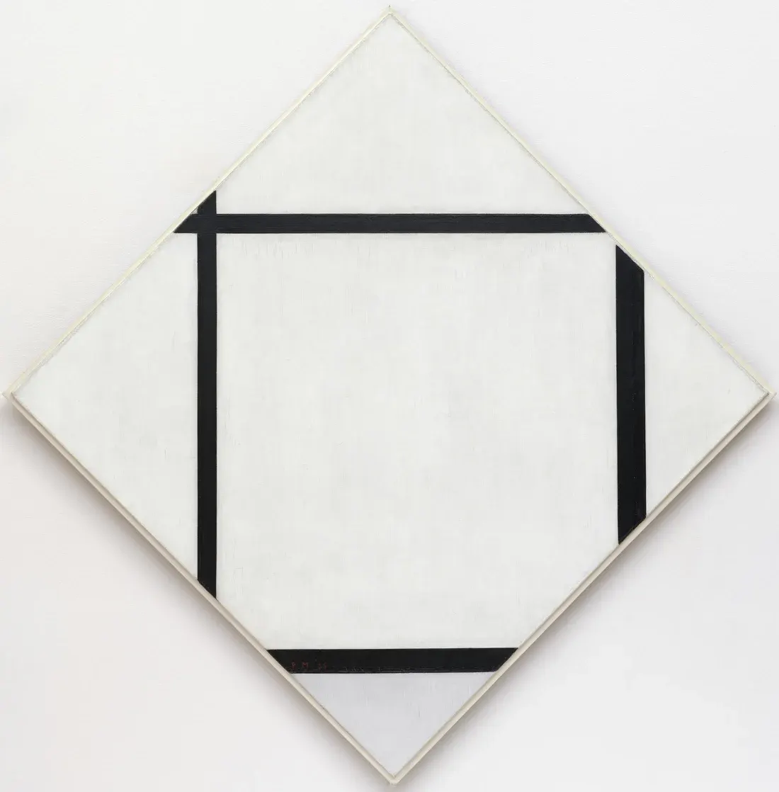
Piet Mondrian, Tableau I: Lozenge with Four Lines and Gray (1926) · The Museum of Modern Art, New York · public domain · Wikimedia Commons — our own choice of example; the abstracts do not say whether it was used in the experiments
The results were threefold. First, participants liked it better when the lines inside the painting were shown placed horizontally and vertically than when the lines were placed diagonally. Second, separately from this, participants preferred the original orientation. The research team added the caveat that this might be because rotating a painting changes not only the direction of the lines but also the left-right balance. Balance is the feeling that the elements within a painting are aligned without leaning to either side. Third, the difference in overall preference was not determined solely by whether the frame was a square or a lozenge. However, the direction of the frame and lines worked together, showing a preference for paintings where the lines inside were parallel to the surrounding frame (PMID 11145089). This abstract does not state the number of participants or the magnitude of the score difference.
The oblique effect is a phenomenon where the eye recognizes horizontally and vertically placed lines better than diagonal lines. The research team connected the first result—namely, the lower scores for paintings tilted so that the lines were diagonal—to this perceptual phenomenon and called it the "oblique effect in aesthetics." Furthermore, citing the fact that horizontal and vertical lines enter the visual system as if privileged and easily, they proposed as one possibility a mechanism in which we find stimuli well-suited to the properties of the human visual system to be pleasing (PMID 11145089). This mechanism is a proposal by the research team, and the only thing directly confirmed by the experiment is that the scores differed depending on the direction.
The second result is not explained by this mechanism alone. Let us suppose there is a painting with a single red square in the lower-right corner and white squares everywhere else. If you rotate this painting 180 degrees, the lines still lie horizontally and vertically, but the red square moves to the upper-left. The direction of the lines remains the same, but the position of the colored square changes. The abstract also "added" and recorded the preference for the original orientation separately from the horizontal and vertical line preference. The research team noted that the share of the preference for the original orientation might be because rotating the painting changes its left-right balance (PMID 11145089), and whether that is balance or something else is not sorted out in this abstract.
Eyes and Pupils in Front of Rotated Paintings
Does the eye move differently across a painting when scores vary depending on the orientation? A subsequent research team looked into this question through eye movements. Eye tracking is a method of using a machine to follow and record where and when a person looks. A fixation is the moment when the eye stops briefly in one place and gazes at that spot. This research team displayed eight Mondrian paintings created between 1921 and 1944 on a monitor one by one for 20 seconds each, either in their original orientation or in one of seven rotated orientations. 10 participants rated how pleasant or unpleasant each painting was on a scale, while a machine recorded the duration of fixations and the distance the eyes jumped to the next spot (PMID 19662947).
The research team reported the eye movements for nine pairs of paintings where the difference according to orientation was statistically distinct. Over the 20 seconds, the duration of a single fixation gradually lengthened, more so in paintings rated as good. The distance the eyes jumped bounced up and down, and that bouncing was also greater in paintings rated as good. The research team wrote that both results are consistent with previous research, confirming that the more pleasing an abstract painting is, the more variously the eye scans the painting and the more balance is revealed. And they concluded that the easier it becomes to find the locations of horizontal and vertical lines rather than oblique lines, the greater the enjoyment of viewing Mondrian paintings can be (PMID 19662947). This is an experiment with 10 participants, and which orientation received better scores is not written in this abstract. This conclusion is the research team's interpretation built upon the observation that eye movements and preference moved together.
A study published the following year targeted Latto's research team's premise. That research team wrote that the result that the original orientation is preferred over rotated orientations relies on the premise that "thick black lines in Mondrian paintings are preferred as long as they are horizontal and vertical," but that premise misses the point that rotating a painting also changes the overall balance. Balance could govern this preference (DOI: 10.1037/a0018155). The tool this research team used was the pupil. A claim emerged in the 1960s and 1970s that people unconsciously dilate their pupils when looking at paintings they like and constrict them in front of unpleasant paintings, but the experiments that made that claim did not evenly match the brightness and contrast of the paintings across conditions. To avoid that weakness, the research team matched brightness and contrast, showed eight Mondrian paintings to 30 participants one by one for 20 seconds in their original orientation or one of seven rotated orientations, and had them rate how much they liked or disliked them while measuring pupil size (DOI: 10.1037/a0018155).
There were two results. The result that preference drops when paintings are rotated compared to the original orientation appeared again, and there was a correlation between the preference reported in words by participants and the unconsciously changed pupil size (DOI: 10.1037/a0018155). Having a correlation means that as the degree of reported goodness varied, pairs in which pupil size varied together were observed, and it means that verbally expressed preference moved together with bodily responses that changed without the participants being conscious of them. However, the magnitude of the correlation has no numbers in the abstract, and results separating the share of balance—which the research team took issue with—from the share of orientation are also not in the abstract.
There are other eye-tracking studies conducted with paintings by various artists, including Mondrian. This study showed paintings depicting recognizable people or objects and paintings like Mondrian's abstractions in their original versions and digitally altered versions with a few simple modifications. Participants' fixations followed the common principle of being drawn to prominent spots, but in paintings with recognizable shapes, there were large individual differences depending on how much the person liked and knew them. Gaze patterns also differed depending on whether they saw the original version first or the altered version first (DOI: 10.3389/fnhum.2011.00098). Whether this difference in order came from Mondrian paintings is not sorted out in the abstract.
Changing Which Color Fills Which Box
There is also an experiment that kept the lines the same and changed only the colors. These researchers repainted three cells where red, yellow, and blue sat in six original Mondrian works, swapping their colors. Because there are six ways to place three colors in three spots, each original produced one original and five variants, making 36 pieces in total (PMID 15832568).
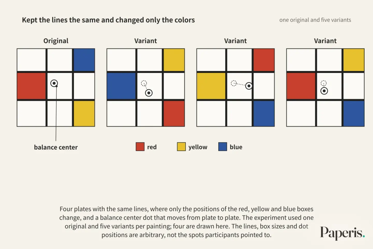
In the first experiment, people with and without design training pointed to the balance center for each picture on a screen and rated how heavy each color cell looked. The balance center is the spot where, if you were to support the picture on that single point, it would seem not to tilt to either side; participants pointed directly on the screen to determine it. In the second experiment, people without design training pointed to the balance center on pictures projected at actual size (PMID 15832568).
Whether they were trained or not, how heavy a color looked depended on the area the color occupied, especially for red and yellow. In both experiments, participants saw the balance center shift between the original and the variants. However, only the people with design training clearly perceived the difference in the balance center among the five variants themselves. The researchers interpreted this as a superior sensitivity to the share that color adds to balance, and concluded that a relationship exists among color, area, and weight among the three primary colors in abstract paintings, and that this influences color balance (PMID 15832568).
This experiment did not ask which side looked better. This experiment is evidence that even when keeping the lines the same and changing only the positions of the color cells, the balance center of a painting appears to shift to the human eye. Whether the balance when rotating a picture or the difference in balance drives preference was not tested by this experiment.
Paintings Whose Original Orientation Is Hard to Guess
There is also research suggesting that there are paintings whose orientation chosen by the painter is difficult to guess. A dissertation written in German illuminated nine Mondrian paintings side by side in their original orientation and rotated 180 degrees, and had people choose which direction the painter intended (DOI: 10.25365/thesis.26490). What this task asks for is the side chosen by the painter, while what the previous scoring experiments asked was how good they looked.
The author divided participants into groups based on their tendencies. The mixed group included people accustomed to mathematical and logical structures, people who do work dealing with space and movement together, rural women viewed as people whose own judgments are not easily swayed, and people with different native reading directions. The author compared these results with those produced by art history majors in another previous study, and called those students "experts." The author reported that clear differences arose between groups in several paintings, and that as a total average across the paintings, the rural women group had the highest correct answer rate while the "experts" from the other study were in the middle (DOI: 10.25365/thesis.26490). The criteria for dividing the groups were hypotheses established by the author, and the number of people per group and correct answer rates are not in the abstract.
Results also varied depending on the paintings. The painting whose original orientation was guessed most successfully was of the type where horizontal and vertical axes cross in a cross shape at the center of the canvas, drawn during the period when Neo-Plasticism was most mature. The more complex the painting and the more colors it had, the less people guessed the original orientation, and vertically elongated paintings and rhombus paintings were difficult for all groups. The author noted that the correct answer rate for female participants was noticeably high in rhombus paintings that looked as though they had been cropped, and suggested conducting further investigations based on gender. The author also surmised that the group dealing with space and movement would have looked at the paintings in a way that took in the whole canvas at a glance, and wrote that in the design illuminating two plates side by side, that way of looking may have canceled out the compositional differences between the two plates and lowered the results (DOI: 10.25365/thesis.26490). This means there were paintings that were easy and paintings that were difficult to guess the original orientation of.
There is also one experiment conducted with abstract paintings outside of Mondrian. This study, which featured Kandinsky in the title, showed 24 abstract paintings to German and Chinese participants with no formal art training, had them change the color of one element in each painting until they liked it, and then asked which one they preferred between their own plate and the original work. Participants liked the paintings with the colors they chose almost as much as the original work, and they chose colors consistently according to the original color composition of each painting (PMID 31565211). The same study showed previously seen paintings and unfamiliar paintings alongside versions with their left and right sides flipped, and asked which side they preferred. The balance points pointed out by participants matched each other to a surprising degree, and where the balance point appeared to lie on the left or right consistently changed their left-right directional preference. The researchers concluded that people without art training are also sensitive to the color and spatial composition of abstract paintings and are influenced by cultural background (PMID 31565211). Because this abstract does not reveal whether Mondrian's paintings were included among the 24 paintings, these results cannot be read across to the results for Mondrian's paintings.
Mondrian Counted by Computers
There are also studies trying to turn Mondrian's paintings into numbers. One research team measured the sizes, numbers, positions, and colors of the canvas, lines, and color cells in all 55 works from the Mondrian catalogue raisonné chosen as typical of his Neoplasticism period, making a list of numbers for each painting (DOI: 10.1167/14.10.653). From that list, they calculated statistics such as the aspect ratio of the canvas, the positions of the lines, the sizes of the cells, and the areas of the colors, and the research team noted that these statistics capture both the characteristics of Mondrian's works and how his style changed over 18 years. Based on these statistics, the research team stated that by plugging in just a few numerical values, they could create synthetic patterns that look like Mondrian paintings from a specific period, and they called this "Mondroid". This is an abstract from a 2014 vision society presentation, and it stops at suggesting that Mondroid be used as material for future preference experiments and eye-tracking experiments. Results from experiments comparing Mondroid with the original works are not in this abstract.
Another research team tested how people read Mondrian-style paintings using a probability model. The research team considered that when we see a Mondrian-style painting consisting only of grids and primary colors, we automatically interpret the process by which the painting came to be, as if it were created by repeatedly dividing an empty canvas. After training the model with Mondrian-style paintings made directly by participants, that model predicted the complexity rankings given by people, captured how stable the drawings were when passed down repeatedly from participant to participant, and passed a visual Turing test (PMID 37199976). The training material noted in the abstract is the Mondrian-style paintings made by the participants, and the results compared with the original Mondrian works and what the Turing test was compared against are not in the abstract.
Being able to make something look like Mondrian and that painting looking as good as the original are different questions, and the results answering the latter question are in neither of these two abstracts.
So What Did We Learn?
Since the paintings, people, and tasks used in each experiment were different, the results are also gathered by experiment. Having people choose one by pairing it with a fake where both horizontal and vertical lines were shifted slightly was the question asked with 25 points by McManus and Gesierich, and in that study, the original was reliably distinguished from the fakes in the judgments of 277 people (DOI: 10.31234/osf.io/n6cf7). In an experiment where the same research team had 84 people directly move the lines to make their own version using 39 points, there was no evidence that the paintings made by the people resembled the original (DOI: 10.31234/osf.io/n6cf7). In an experiment by Latto's team where 8 points were shown one by one floating in eight directions to be scored, the scores were lower in the direction where the lines tilted diagonally, and separately, the scores in the original direction were higher (PMID 11145089). In an experiment where 6 points had their color cells repainted, the center of balance appeared to shift, and that experiment did not ask for preferences (PMID 15832568). In a thesis where 9 points were placed side-by-side with a plate rotated 180 degrees to guess the direction chosen by the artist, the direction was guessed less often for complex, colorful paintings, vertically elongated paintings, and diamond-shaped paintings (DOI: 10.25365/thesis.26490).
When paired with a fake where the lines were shifted, the original was reliably distinguished (in the 84-person experiment, the original was preferred), when paintings were tilted diagonally their scores dropped, and separately the scores in the original direction were higher. However, the former came from a task of choosing by pairing, the latter two came from a task of scoring one by one, their magnitude is not present as numbers in the abstract, and in the task of guessing the direction chosen by the artist, the correct answer did not emerge well depending on the painting. Fakes where the lines were shifted slightly at random were also distinguished from the original, so the idea that shifting lines arbitrarily makes them look like the same painting does not fit these results. However, the degree to which that difference was felt varied from person to person and the results differed depending on the task, so it cannot be broadened to "anyone recognizes the original."
Explanations are provided separately for each result. For the result where scores drop when paintings are tilted diagonally, the oblique effect—where our eyes receive horizontal and vertical lines better—is proposed as a mechanism (PMID 11145089). Eye movement researchers noted that the easier it is to find horizontal and vertical lines, the greater the pleasure can be, while also writing that the more visually pleasing a painting is, the more prominent its balance is as well (PMID 19662947). For the result where the original direction was preferred even though the lines remained horizontal and vertical, clues and criticisms are attached noting that rotating a painting also changes its left-right balance (PMID 11145089) (DOI: 10.1037/a0018155). There is also the result where changing the color cells made the center of balance appear to shift, but that experiment did not ask for preferences (PMID 15832568). Regarding the result where the original was separated from fakes with only slightly shifted line positions, none of the abstracts reviewed in this article tested the reason for this. Familiarity—the thought that one might have seen the original somewhere before—is also a candidate that can be considered, but among the abstracts reviewed in this article, none tested that with Mondrian's paintings. One abstract painting experiment that did not disclose Mondrian asked about previously seen pictures and unfamiliar pictures separately, but the result of that difference is not in the abstract (PMID 31565211). It has not yet been sorted out which explanation matters and by how much. Among the abstracts reviewed in this article, there was no experiment that showed variants with only a single change in lines, colors, or direction to people who had and had not seen the original, and synthetic patterns like Mondroid are proposed as future experimental materials (DOI: 10.1167/14.10.653).
Source Papers
- "I C McManus and Paul Gesiak: Experimenting with Mondrian: Comparing the Method of Production with the Method of Choice" (2020, 2014 conference poster abstract) — DOI: 10.31234/osf.io/n6cf7 — In 5 studies with 277 people who chose between 25 original works and two fake versions where the horizontal and vertical lines were randomly moved by small or slightly larger amounts, the originals were reliably distinguished (with individual differences), and when 84 people were asked to move the lines themselves, there was no evidence that the paintings they created resembled the originals. The researchers interpreted this as a limitation of visual working memory.
- "An oblique effect in aesthetics: homage to Mondrian (1872-1944)" (2000) — PMID 11145089 — 8 Mondrian paintings evaluated one by one on a 7-point scale in eight directions: people preferred the original directions of the horizontal and vertical lines, the tilt direction itself made no difference, and they preferred it when the lines and the frame were aligned. They proposed a mechanism linked to the oblique effect in perception.
- "Mondrian, eye movements, and the oblique effect" (2009) — PMID 19662947 — 10 people, observing 8 paintings × 8 directions for 20 seconds each: for paintings rated as good, viewing time increased and the fluctuations in the distance of eye skips were greater.
- "When viewing variations in paintings by Mondrian, aesthetic preferences correlate with pupil size" (2010) — DOI: 10.1037/a0018155 — Building on the criticism that rotating them also changes the balance, 30 people looked at 8 paintings with matched brightness and contrast one by one: the result that preference drops when rotated was replicated, and reported preference correlated with pupil size.
- "How Do We See Art: An Eye-Tracker Study" (2011) — DOI: 10.3389/fnhum.2011.00098 — Originals and modified versions of works by Mondrian and several other artists: gazes were drawn to prominent spots, and gaze patterns differed depending on whether people saw the original or the modified version first.
- "Spatial balance of color triads in the abstract art of Piet Mondrian" (2005) — PMID 15832568 — 36 paintings where the three primary color cells of 6 original works were swapped: the weight of colors varied according to their area, the shift in the center of balance between originals and modified versions was detected by everyone, and shifts between modified versions were detected only by people with design training.
- "Mondrian oder die Relativität des Gleichgewichts" (2012, thesis) — DOI: 10.25365/thesis.26490 — Matching 9 paintings to their original orientation versus a 180-degree rotated orientation: correct response rates varied by group and painting, cross-axis paintings were matched well, more complex and colorful paintings were matched less well, and vertical paintings and diamond paintings were difficult for all groups. The author suggested a gender study.
- "Kandinsky or Me? How Free Is the Eye of the Beholder in Abstract Art?" (2019) — PMID 31565211 — German and Chinese participants with no art training (it is unclear from the abstract whether Mondrian was included): across 24 abstract paintings, they liked the colors they changed themselves as much as the originals, their settings for the balance point matched, and the balance point shifted left-right directional preferences.
- "'Natural' image statistics and 'Neoplasticism' - what could be the formula to compose a Mondrian?" (2014, conference abstract) — DOI: 10.1167/14.10.653 — Quantifying the lines, cells, and colors of 55 canonical Neoplasticism works from the catalogue raisonné to generate statistics, proposing that this can be used to create synthetic patterns called "Mondroids" that look like a specific period.
- "Generative visual common sense: Testing analysis-by-synthesis on Mondrian-style image" (2023) — PMID 37199976 — A probabilistic model trained on Mondrian-style paintings created by participants predicted complexity rankings and transmission stability, and passed a visual Turing test. The conclusion is that the human eye reads paintings from the perspective of the process by which they came to be.
Sources (10)
- I C McManus and Paul Gesiak: Experimenting with Mondrian: Comparing the Method of Production with the Method of ChoiceDOI 10.31234/osf.io/n6cf7
- An oblique effect in aesthetics: homage to Mondrian (1872-1944)PMID 11145089
- Mondrian, eye movements, and the oblique effectPMID 19662947
- When viewing variations in paintings by Mondrian, aesthetic preferences correlate with pupil sizeDOI 10.1037/a0018155
- How Do We See Art: An Eye-Tracker StudyDOI 10.3389/fnhum.2011.00098
- Spatial balance of color triads in the abstract art of Piet MondrianPMID 15832568
- Mondrian oder die Relativität des GleichgewichtsDOI 10.25365/thesis.26490
- Kandinsky or Me? How Free Is the Eye of the Beholder in Abstract Art?PMID 31565211
- 'Natural' image statistics and 'Neoplasticism' - what could be the formula to compose a Mondrian?DOI 10.1167/14.10.653
- Generative visual common sense: Testing analysis-by-synthesis on Mondrian-style imagePMID 37199976