Paperis Articles
Seurat — Do the Dots Merge as You Step Back? A Yellow That Darkened
In La Grande Jatte, Seurat mixed his paints as little as possible and laid them down in divided strokes. Do the dots really blend in the eye and look brighter? Lab checkerboards of complementary colors do blend when fine enough, and in one gray-only experiment the blend looked brighter or darker depending on fineness and lightness difference. And the painting's zinc yellow strokes have already darkened.
Your field's papers, as audio
Pick your fields and journals — Paperis summarizes the key papers and turns them into audio. Listen on your commute.
Start Paperis free →Seurat — Do the Dots Merge as You Step Back? A Yellow That Darkened
1886 Paris, A Sunday Covered in Dots
In the spring of 1886, at the eighth and final Impressionist exhibition held in Paris, a painting measuring over 3 meters wide was hung. It is "A Sunday Afternoon on the Island of La Grande Jatte — 1884", painted by the twenty-six-year-old French painter Georges Seurat. It is a painting of people taking a walk with parasols or sitting and resting on the grass on an island in the Seine, but when you get close, the people, trees, and grass all disappear, and only small dots of color and short brushstrokes are densely packed. Although 1884 is attached to the title, this painting is the first time Seurat used the technique of painting with dots, and the time he started it was October 1885 (DOI: 10.1002/col.20223). The painting currently hangs in the Art Institute of Chicago in the United States, and Seurat passed away at the age of thirty-one in 1891, five years after exhibiting this painting.
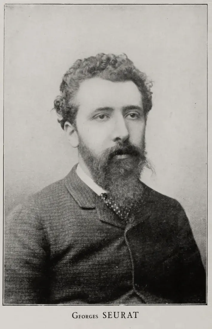
Georges Seurat, photograph c. 1888 (photographer unknown) · public domain · Wikimedia Commons
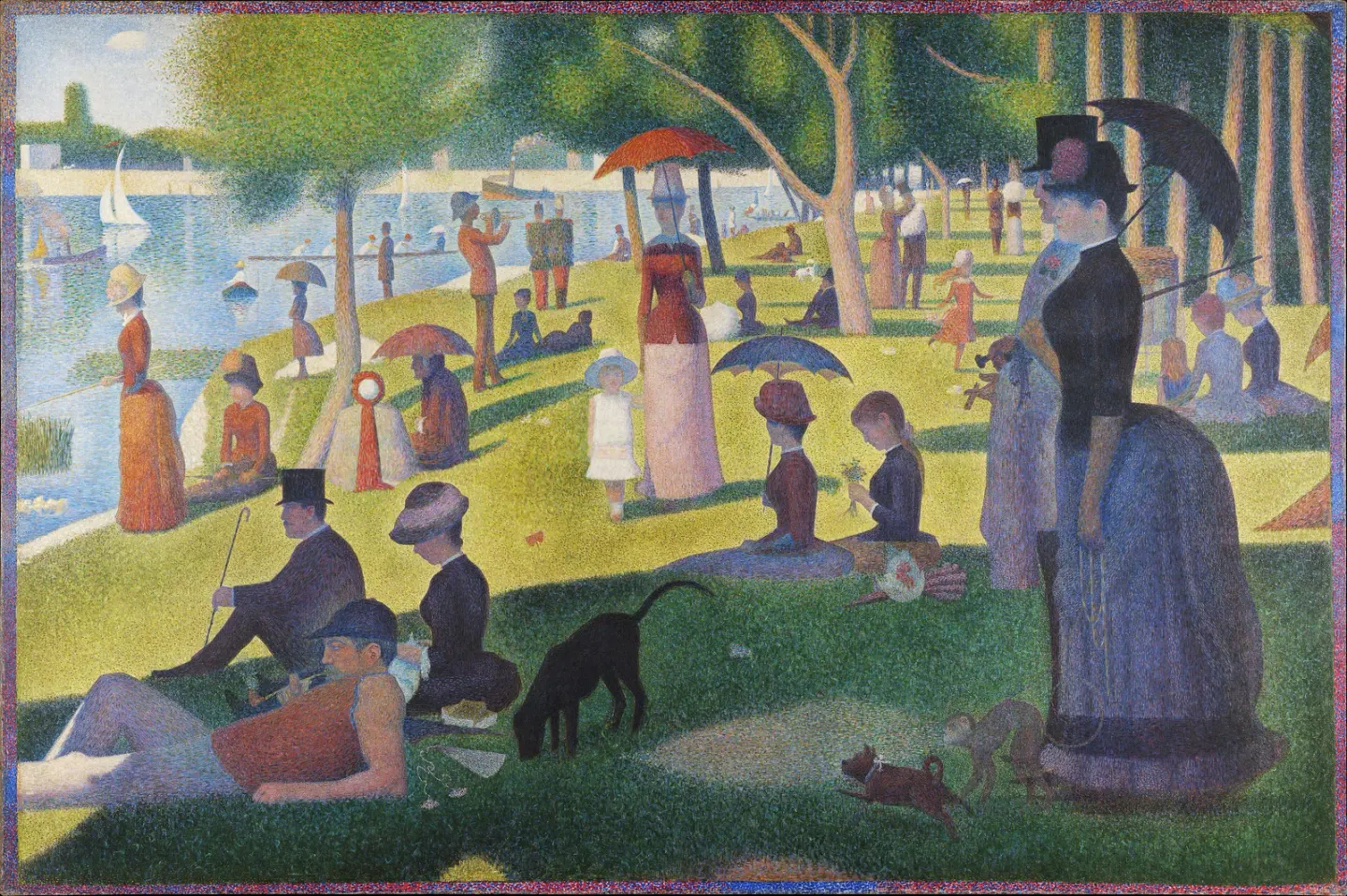
Georges Seurat, A Sunday Afternoon on the Island of La Grande Jatte — 1884 (1884–1886) · The Art Institute of Chicago · public domain · Wikimedia Commons
Pointillism is a painting technique in which colors are created not by mixing paints on a palette, but by placing them side by side on the canvas as small dots or short brushstrokes. The question surrounding this painting is one. Do the dots placed side by side really mix in the viewer's eye, and do the spots mixed that way look brighter? The answer is divided into three parts. What Seurat is recorded as having hoped for, what studies testing the eye that sees color have seen, and what nearly 140 years of time have done to those dots.
Common Belief: Dots Mix in the Eye
A short 2019 historical article introduces Seurat's dots as "a shot fired by the painter and inspired by the scientist." It describes how "A Sunday on La Grande Jatte," painted with thousands of colored dots, landed on the art world like a shot, triggered by the painter's imagination and inspired by a scientist's color theory (PMID 31519312). There are more accounts connecting science and painting from this period. A 1979 historical account covering turn-of-the-century French painting suggests that the scientific discoveries of British physicist James Clerk Maxwell and German scientist Hermann von Helmholtz were introduced to France via American physicist Ogden Rood, playing an important role in the color expression of that era (DOI: 10.1002/col.5080040404). This article called Neo-Impressionism "the most scientific school of color in art" in its title, but does not single out Seurat in the abstract.
Neo-Impressionism is a painting movement centered on Seurat in the mid-1880s, relying on color theory and painted with pointillism. This group was also called "chroma-luminists," and an art history paper comparing the color ideas of painters from the same period classifies their approach as part of the scientific branch rather than the symbolic and philosophical one (DOI: 10.32782/2411-3034-2024-35-18).
A 2006 conservation science study notes Seurat's goal as follows. He tried to mix paints representing colors visible in the spectrum as little as possible on the palette, applied brushstrokes separately, give "luminosity" to the canvas, and explore color theories spreading at the time, such as simultaneous contrast, "in his own interpretation" (DOI: 10.1002/col.20223). The difference between additive mixing, which overlaps light, and subtractive mixing, which mixes paints, as well as simultaneous contrast, where a color appears pushed toward the opposite of its surrounding color, were covered in "Color — One Dab of Paint, Changed by Its Neighbors".
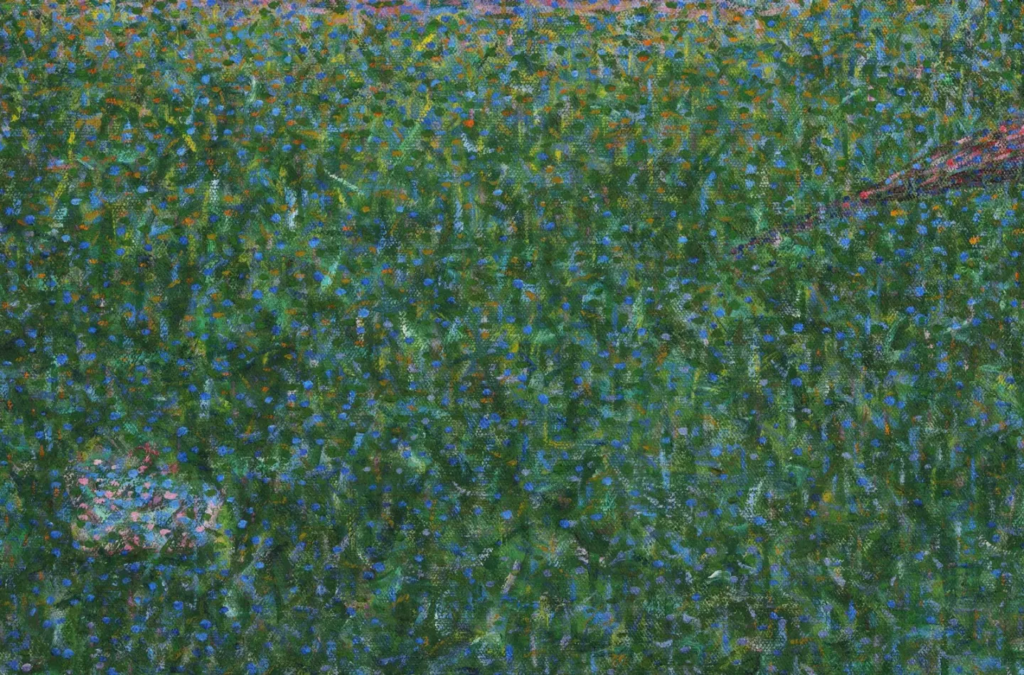
Detail of the same painting — a patch that reads as one grassy colour from afar breaks up into dots of different colours
Pointillism is often introduced as a technique that leaves the mixing of colors to the viewer's eye instead of the palette (DOI: 10.17289/jkscs.38.3.2024.08.83, DOI: 10.2307/1575043, PMID 12677811). Optical mixing is when small dots of different colors are so tiny that they cannot be distinguished individually, and the eye sees that area as a single color. A 1983 contribution article, written following criticism by others surrounding Albers' color concepts, distinguished the two types of mixing like this. Applying two paints evenly to the canvas with a palette knife after blending them is subtractive mixing, whereas pointillism, which places two paints side by side on the canvas in dots small enough to be indistinguishable when stepping back, is spatial mixing, and the results of the two cases are different (DOI: 10.2307/1575043).
The viewer's experience is described as follows. When viewed from a certain distance, the colors merge; when approaching the painting, the merging disappears and only multiple color patches are visible; and when stepping back again, they merge and the painting becomes clear (PMID 12677811). This description is an explanation from a biographical text introducing Seurat, not an experimental report. The questions this article will follow are two. Do dots really mix in the eye when distance is applied? And in light of the "luminosity" Seurat hoped for, do such mixed areas appear brighter? The second question is raised from the "luminosity" of the 2006 study in this article. Experiments gave different answers to these two.
They Do Mix — When the Lab Pattern Is Fine Enough
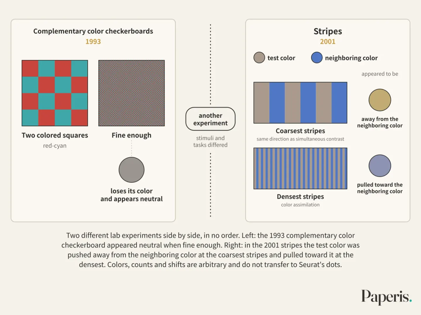
When two colored squares are laid out alternately like a checkerboard and the squares are made progressively smaller, at a certain size the checkerboard loses its color and appears neutral (PMID 8316521). The two colors used in this 1993 experiment were complementary pairs. Complementary colors are two colors placed opposite each other on the color wheel, and red-cyan, green-magenta, and yellow-blue from this experiment are such pairs. The same thing happened when two-colored stripes were used instead of a checkerboard. The researcher explained this as the eye gathering together and discarding color information within a certain area, and reported that the area gathering color is much wider than the unit responding to light-and-dark differences. In plain terms, for color, the eye groups together and sees a much wider area at once than it does for brightness.
The threshold for mixing differed for each color pair. The red-cyan and green-magenta pairs had to be dense enough for the pattern to repeat more than 7 to 8 times within 1 degree of the visual field to mix, whereas the yellow-blue pair already mixed at about 4 times per 1 degree (PMID 8316521). A visual field of 1 degree is the width falling between two lines extending from the eye when they are separated by 1 degree, and the same pattern fits more times into that width and becomes denser the further away it is viewed. The yellow-blue checkerboard in the lab became a single mass even at a pattern about twice as coarse as the other pairs. However, since these values were obtained from complementary color checkerboards alternately laid out in equal areas, they cannot be transferred to the dots in Seurat's paintings or to the distance of a few meters in front of a painting.
Another experiment measured the influence of neighboring colors instead of mixing. This 2001 experiment placed a test color and a neighboring color to tint it alternately in stripes, changed the density of the stripes in four steps, and had observers match what color the test color appeared to be (PMID 11301075). At the densest stripes, repeating 9 times per 1 degree, the test color was pulled toward the neighboring color. Color assimilation is a phenomenon where one color appears similar to the surrounding color. At the coarsest stripes, which were 0.7 times per 1 degree, it was pushed in the opposite direction away from the neighboring color, which is the same direction as simultaneous contrast. The point where the two effects split was around 4 times per 1 degree, and it was similar whichever color direction was measured.
In lab stripes, simultaneous contrast, where neighboring colors push each other away, and assimilation, where they become similar to each other, appeared at different densities. This experiment did not measure the threshold at which colors mix into a single color, and its stimuli and tasks differed from the previous checkerboard experiment, so the two results cannot be strung together into a single line to assign an order like "contrast then assimilation, then mixing." The single line to take away from this section is this: two-color checkerboards in the lab mixed into a single color if they were fine enough. However, how fine they needed to be to mix differed by color pair, and in another stripe experiment, when the patterns were coarse, neighboring colors actually looked more different from each other.
Brighter and Darker Too — A Side of the Grey Checkerboard
Even when looking strictly at brightness, two side-by-side greys do not always look brighter when mixed (DOI: 10.17289/jkscs.38.3.2024.08.83). This colour-perception experiment published in 2024 stripped away colour and left only brightness. It showed participants a checkerboard stimulus alternating two greys of different brightness in equal areas alongside a single grey with a physical brightness identical to the even mixture of those two greys, and asked them to compare the brightness of the two stimuli. The checkerboard varied in fineness by dividing a 10-degree square field of view horizontally and vertically from 10 to 70 grid cells, and the brightness difference between the two greys had two conditions: small and large.
Although the average brightness was identical in every pair, people saw the two differently. When the difference between the two greys was small and the grid cells were coarse, the checkerboard looked darker than the single grey, but when the grid cells were fine, it looked brighter. When the difference was large, the checkerboard looked brighter at most average brightness steps, but in some conditions with coarse cells, the reverse was true. The authors concluded that people tend to see the mixed side as either brighter or darker depending on fineness and the brightness difference (DOI: 10.17289/jkscs.38.3.2024.08.83). This experiment used only colourless grey steps and is the result of judging checkerboard patterns made as experimental stimuli.
What colour the mixed result actually turns out to be depends on the paints used. The earlier 1983 contribution points out that colour names are labels that lump a wide range of appearances together. Even a paint called blue may be a red-shaded blue or a green-shaded blue when viewed alone. Therefore, that article suggests that the passage where German-born painter and colour educator Josef Albers wrote that he obtained green by placing blue and yellow dots side by side is misleading yet could be true. The explanation is that if he selected green-yellow and green-blue paints through trial and error, the mixed spot would have taken on a greenish tint (DOI: 10.2307/1575043).
Whether dots appear mixed and whether the mixed spot looks brighter are separate questions, and the answer provided by a single experiment using only grey for the second question was "Brighter or darker, depending on conditions." And if the mixed result depends on the actual paint colours, the next question is whether the paints in A Sunday on La Grande Jatte are still the colours Seurat painted.
The Yellow You See Now — Darkened Zinc Yellow
Records showing that some brushstrokes in A Sunday on La Grande Jatte had darkened already appear in 1892 (PMID 20953774). This was the year after Seurat passed away. The yellow paint has been pointed to as the cause. Zinc yellow is a yellow paint powder made from a compound containing zinc and chromium, which initially takes on a bright yellowish-green yellow. Over time, this paint can darken into a dull brownish-yellow (DOI: 10.1039/c0ja00151a).
In addition to the whole painting having darkened due to the natural aging of the materials, paint analysis revealed that the brushstrokes containing zinc yellow darkened significantly. Yellow brushstrokes turned to a color similar to brownish-yellow, yellowish-green brushstrokes turned to olive green, and orange brushstrokes turned to reddish-brown (DOI: 10.1002/col.20223). This means that among the bright yellow, yellowish-green, and orange dots painted by Seurat, some containing zinc yellow now remain as dark dots of brownish-yellow, olive, and reddish-brown.
The darkening process was examined in the laboratory using reconstructed samples that accelerated the passage of time. Researchers made paint by mixing zinc yellow with linseed oil, similar to the paint in A Sunday on La Grande Jatte, and exposed it to light and sulfur dioxide while varying the air humidity between 50% and 90%. The color change appeared alongside a shift in the chromium within the paint into a different chemical state, with the change in chromium being greatest at 90% humidity, while the change caused by light stood out at 50% humidity (DOI: 10.1039/c0ja00151a). Another study revealed that in similar aging experiments, samples that turned olive green at 90% humidity mostly contained altered chromium, and the color of samples that turned brownish-yellow at 50% humidity was due to another chromium compound with an orange tint (PMID 20953774). The altered component in these reconstructed samples was found only in the top few micrometers of the paint. One micrometer is one-thousandth of a millimeter. Because the layer was so thin and its crystal structure was not well-formed, it had not been easily captured by other analysis methods until now, but that thin layer drastically changed the color visible on the surface. A similar phenomenon was confirmed in brownish-yellow paint brushstroke samples actually detached from A Sunday on La Grande Jatte, and the same two chromium states were detected.
The same study showed in laboratory simulation samples that the equilibrium between the orange-tinted chromium compound and the yellow chromium compound shifts in both directions within the paint film. When the orange-tinted compound was exposed to a strong alkaline gas, it returned to a bright yellow (PMID 20953774). Only this orange-tinted compound was reversed, and there is no mention in the abstract of having reversed the altered chromium that created the olive green. There is also no mention in the abstract of having applied this treatment to the painting. There are other paintings where chromium-containing yellow paint has darkened. Chromium-based yellows, such as lead-containing chrome yellow and zinc yellow, are reported to be considerably darkened today in paintings like Van Gogh's Sunflowers and A Sunday on La Grande Jatte (DOI: 10.1039/c1ra00614b).
What did it look like in the beginning, then? A 2006 study measured the light bouncing back from the darkened areas of the painting by color and compared them with samples painted with unchanged, similar-colored paint (DOI: 10.1002/col.20223). By adding theories calculating how light is absorbed and scattered within the paint layer, digitally captured photographs managed with color, and image editing programs, the study digitally revived the original appearance of how it would have been brighter. This is a simulation retraced through measurement and theory, not a photograph taken of the painting in 1886. The colors of A Sunday on La Grande Jatte that we see in Chicago today are not the same as the colors Seurat painted, and the difference is particularly large in dots containing zinc yellow. The story of finding the reasons for the altered colors of the painting in the painter's eyes was covered in "Monet's Japanese Footbridge — The Same Bridge, Different Colours", but the part that changed in A Sunday on La Grande Jatte is the paint.
Walking Up to the Painting
This step is an assumption of applying the preceding evidence to the painting. There is no study in the evidence collected by this article that directly measured what a viewer sees and at what distance in front of "A Sunday on La Grande Jatte".
If you view this painting from the end of the exhibition hall, as the biographical writings describe, the colors will blend so that the grass, river, and parasol appear distinct as a single mass (PMID 12677811). If you step closer one step at a time, just as the same writings say, the patterns in the painting will become sparse within your field of view, the blending will disappear, and multiple patches of color will be visible (PMID 12677811). In the laboratory's complementary color checkerboard, the fineness of the blending differed for each color pair (PMID 8316521), but there is no study in the evidence for this article that measured whether the dots of "La Grande Jatte" were placed as such pairs, or which colors dissolve first in front of the painting.
Among those patches, the brushstrokes where Seurat applied zinc yellow among the spots dabbed in yellowish-green or orange are now olive green and reddish brown (DOI: 10.1002/col.20223). If the blended result depends on the actual paint color (DOI: 10.2307/1575043), one might ask whether the colors that appear blended from a distance were also the same colors seen by audiences in 1886. A study measuring this is likewise not in the evidence collected by this article.
Still Under Debate
First, when assimilation occurs and when simultaneous contrast occurs is still being sorted out. Attempts to explain this within a single framework are long-standing. A 1984 neural model proposed explaining both the colour mixing of dense patterns and simultaneous contrast with a single principle (PMID 6099349). While surrounding stripes commonly induce assimilation, earlier reports indicate that under certain conditions, they induce simultaneous contrast instead or produce no effect at all (PMID 30347096). That 2018 experiment examined whether the brightness difference between the test colour and the surround is the key to assimilation; when the colour shifted in one direction, the brightness difference was the key, but when it shifted in another, it was not. Another study that same year proposed a computational model to explain, from the assimilation side, an illusion where the brightness of grey appears to vary depending on the surround, measuring its strength according to pattern width and mimicking it (PMID 30294510). That study notes that many views hold this illusion as not fully fitting into either assimilation or contrast. A 2010 model attempted to tie colour assimilation and simultaneous contrast into a single mathematical framework (PMID 21047737). Both are models that reported a good fit with experimental data, and there is no evidence in this article's reference list that either one has become established as the standard theory.
Second, the evidence is thin on whether dot mixes appear brighter. The brightness experiment this article relies on used only grey steps (DOI: 10.17289/jkscs.38.3.2024.08.83), and there are no studies in the reference list that measured the brightness of areas where chromatic dots are mixed in front of a painting.
Third, the original colours of "A Sunday on La Grande Jatte" can only be seen as simulations within the evidence of this article. The 2006 digital restoration is an estimate relying on measurement and theory (DOI: 10.1002/col.20223), and the reaction that reverted the orange-ish compound is the result of laboratory samples (PMID 20953774).
Fourth, the label "scientific" itself is an interpretation. "The most scientific colour movement in art" is an evaluation from a 1979 text (DOI: 10.1002/col.5080040404), and a 2006 study notes that Seurat explored colour theories "in his own interpretation" (DOI: 10.1002/col.20223). Studies that directly examine how accurately Seurat translated which theories are not in this article's references.
So What Did We Learn?
As the 2006 study notes, Seurat tried to give his canvas luminosity by mixing paints as little as possible on the palette and placing them as separate dots. The complementary checkerboards in the lab actually looked like a single color when fine enough, but the fineness required for this blending varied from one color pair to another. In other stripe experiments, fine patterns produced assimilation, while sparse ones produced simultaneous contrast. In one experiment using only gray, whether the blended side appeared brighter depended on the fineness and the difference in brightness.
Layered onto this are changes in the painting itself. There are records that some brushstrokes had already darkened the year after Seurat died, and the yellow, yellow-green, and some orange brushstrokes containing zinc yellow—pointed to as the cause—are now yellow-ochre, olive, and reddish-brown. Neither the claim that Seurat implemented his theory precisely nor the claim that pointillism failed is supported by this evidence. What the evidence supports is narrower: the complementary patterns in the lab blended when fine enough, whether the blended side appeared brighter in the gray checkerboard depended on the conditions, and the painting we see today has darkened overall, with the dots containing zinc yellow having changed the most from the colors Seurat applied.
Source Papers
- "Rejuvenating the color palette of Georges Seurat's A Sunday on La Grande Jatte—1884: A simulation" (2006) — DOI: 10.1002/col.20223 — From October 1885, this painting explored pointillism, minimizing palette mixing to pursue "brightness" and simultaneous contrast "in its own interpreted way." Overall aging + discoloration of zinc yellow brushstrokes (yellow → ochre, yellowish green → olive, orange → reddish brown). Digital simulation of the original appearance using in-situ spectroscopic measurements, swatches, the Kubelka-Munk theory, and digital photography.
- "Optical value mixing effect of juxtaposed color mixture stimulation" (2024) — DOI: 10.17289/jkscs.38.3.2024.08.83 — Achromatic checkerboards (10×10 to 70×70, two levels of brightness difference) versus solid colors of the same average brightness: even when physical averages are identical, they are perceived differently, judged as either brighter or darker depending on fineness and brightness difference.
- "Chrome yellow in nineteenth century art: historic reconstructions of an artists' pigment" (2011) — DOI: 10.1039/c1ra00614b — Introductory background description that chrome-based pigments such as chrome yellow and zinc yellow used by Van Gogh and Seurat are significantly darkened in "Sunflowers" and "A Grande Jatte." The main text reconstructs 19th-century manufacturing methods (recipes, tubes, and paint samples match well).
- "The darkening of zinc yellow: XANES speciation of chromium in artist's paints after light and chemical exposures" (2011) — DOI: 10.1039/c0ja00151a — Bright yellowish-green zinc yellow can turn into a dull ochre color, the color change is linked to a change in the chemical state of chromium (Cr(VI)→Cr(III)), with the change maximized at high humidity and light-induced change occurring at low humidity.
- "Electron energy loss spectroscopy elucidates the elusive darkening of zinc potassium chromate in Georges Seurat's A Sunday on La Grande Jatte--1884." (2011) — PMID 20953774 — Discoloration was already recorded in 1892. Recreated via artificial aging, with Cr(III) in olive samples and dichromate ions in ochre samples, existing only in the top few micrometers, also confirmed in painting samples; chromate-dichromate equilibrium is reversible in the laboratory — only orange dichromate can be turned back to bright yellow with alkaline gas.
- "Some Misunderstandings about Color Perception, Color Mixture and Color Measurement" (1983) — DOI: 10.2307/1575043 — Opinion piece (replying to criticism from others). Palette mixing (subtractive) and pointillism (spatial mixing) yield different results, and the result depends on the actual paint. Color names are broad labels. Albers' blue + yellow dots → green is misleading, but could be true if the paints were chosen carefully.
- "The role of spatial frequency in color induction." (2001) — PMID 11301075 — Stripes at 0.7–9.0 cpd: assimilation at the finest, contrast at the coarsest, with the transition point around 4 cpd (independent of color axis).
- "Colour pools, brightness pools, assimilation, and the spatial resolving power of the human colour-vision system." (1993) — PMID 8316521 — Complementary color checkerboards become achromatic at a certain fineness, color pools are larger than brightness units, red-cyan and green-magenta at about 7–8 cpd, yellow-blue at about 4 cpd.
- "The effect of luminance differences on color assimilation." (2018) — PMID 30347096 — Stripe borders cause assimilation instead of contrast or no effect depending on conditions. Luminance differences are the key to assimilation on a single color axis (s-axis).
- "An adaptive scale Gaussian filter to explain White's illusion from the viewpoint of lightness assimilation..." (2018) — PMID 30294510 — Re-evaluates the intensity of lightness assimilation illusion (White's illusion) according to pattern width and gray patch length, simulated with a linear filter model.
- "Colour-spatial vision." (1984) — PMID 6099349 — Critical review + proposed neural model: attempts to explain color mixing of high-frequency components, simultaneous/successive contrast, etc., with a single model.
- "Toward a unified chromatic induction model." (2010) — PMID 21047737 — Integrates color assimilation and contrast into a single multi-resolution model, with acceptable agreement with experimental data.
- "КОНЦЕПЦІЯ КОЛЬОРУ У ТВОРЧІЙ ФІЛОСОФІЇ ХУДОЖНИКІВ-ПОСТІМПРЕСІОНІСТІВ" (2024) — DOI: 10.32782/2411-3034-2024-35-18 — Analysis of Post-Impressionist color thought: the scientific approach of the Neo-Impressionists (color-light theorists) versus the philosophical approach of Synthetism and Symbolism.
- "[Optic mixing of colours in Seurat's painting]." (2002) — PMID 12677811 — Biographical and historical article. Explanation that colors merge at a certain distance, appear as color patches when approaching, and merge clearly again when stepping back.
- "Neo‐impressionism: The most scientific of all schools of color in art" (1979) — DOI: 10.1002/col.5080040404 — Historical narrative. Scientific discoveries by Maxwell and Helmholtz were introduced to France via Roud and played an important role in color expression in turn-of-the-century French painting (no mention of Seurat in green).
- "Seurat's Dots: A Shot Heard 'Round the Art World-Fired by an Artist, Inspired by a Scientist." (2019) — PMID 31519312 — Historical article. Describes "A Grande Jatte" with its thousands of color dots as a "shot" by an artist inspired by a scientist's color theory.
Sources (16)
- Rejuvenating the color palette of Georges Seurat's A Sunday on La Grande Jatte—1884: A simulationDOI 10.1002/col.20223
- Optical value mixing effect of juxtaposed color mixture stimulationDOI 10.17289/jkscs.38.3.2024.08.83
- Chrome yellow in nineteenth century art: historic reconstructions of an artists' pigmentDOI 10.1039/c1ra00614b
- The darkening of zinc yellow: XANES speciation of chromium in artist's paints after light and chemical exposuresDOI 10.1039/c0ja00151a
- Electron energy loss spectroscopy elucidates the elusive darkening of zinc potassium chromate in Georges Seurat's A Sunday on La Grande Jatte — 1884PMID 20953774
- Some Misunderstandings about Color Perception, Color Mixture and Color MeasurementDOI 10.2307/1575043
- The role of spatial frequency in color inductionPMID 11301075
- Colour pools, brightness pools, assimilation, and the spatial resolving power of the human colour-vision systemPMID 8316521
- The effect of luminance differences on color assimilationPMID 30347096
- An adaptive scale Gaussian filter to explain White's illusion from the viewpoint of lightness assimilationPMID 30294510
- Colour-spatial visionPMID 6099349
- Toward a unified chromatic induction modelPMID 21047737
- КОНЦЕПЦІЯ КОЛЬОРУ У ТВОРЧІЙ ФІЛОСОФІЇ ХУДОЖНИКІВ-ПОСТІМПРЕСІОНІСТІВDOI 10.32782/2411-3034-2024-35-18
- [Optic mixing of colours in Seurat's painting]PMID 12677811
- Neo‐impressionism: The most scientific of all schools of color in artDOI 10.1002/col.5080040404
- Seurat's Dots: A Shot Heard 'Round the Art World-Fired by an Artist, Inspired by a ScientistPMID 31519312